Description:
Displays a drop down list of choices, these choices could be based on a static list, database call, roles or a look up list category.
Design:
Example:
Let’s build and execute the SelectWidgetDef example.
- Create a new form definition called “SelectWidgetDef”
- Select the Open Desinger checkbox and click the “Create” button
- Drag a Select widget to the canvas
- Double-click on the widget to configure the inputs as shown in the below graphic

- If configuring a static list, then the list should be defined using the following format: Text, value.
- If using a database call to get the list, SQL call should be a select statement where the first column should be the text, and the second column being the value.
- If roles are used, multiple roles can be selected, the drop down will list all members of the selected roles.
- If a lookup category is selected, then all text, values under the selected category will be displayed.
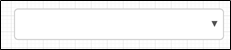
- The rendered control will look as follow:

- Click on Save button and Close the popup window
- Navigate to UI menu and Preview the form. The rendered widget will look as shown in the below graphic