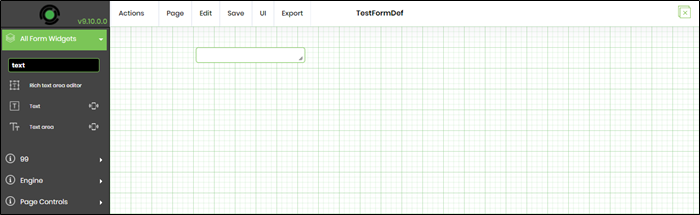
The Forms designer has 4 UI parts. The Toolbox is on the left, the menu is on the top, the design canvas is in the middle, and the properties popup window for each form control on Edit / Double-Click.
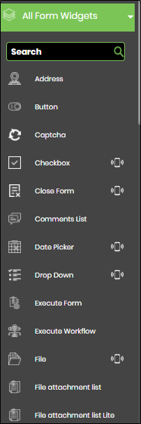
The form toolbox contains the following list of controls: (only a partial list is shown)
To add controls to the design canvas, drag a control from the toolbox and drop it on the design canvas.
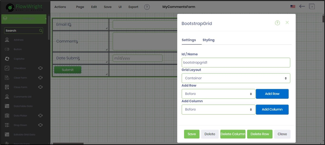
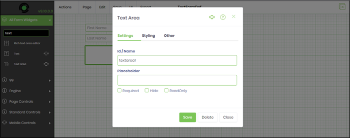
The properties window for each form widget is modal and has been grouped into four logical sections - Settings, Conditions, Styling, and ToolTip.
Let’s drag a text box to the canvas.
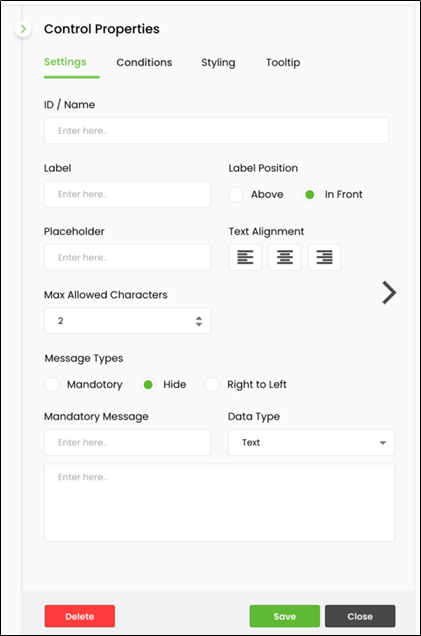
The form control properties are displayed in a popup window for configuration. Double-click on the text box to view the properties for the text box. The text box has the following properties. Provide a name to the text box. Provide a placeholder text to appear when the form is rendered. Select the data type for the input information (numeric, currency, phone, email, SSN, text, password, regular expression, custom format). Select the checkbox to mark the textbox as required, hide, or read only. Provide a value for the maximum characters for input. Click on the Save button to confirm changes. Click the Close button to close the dialog without saving the changes. Click the Delete button to remove the control from the design canvas.
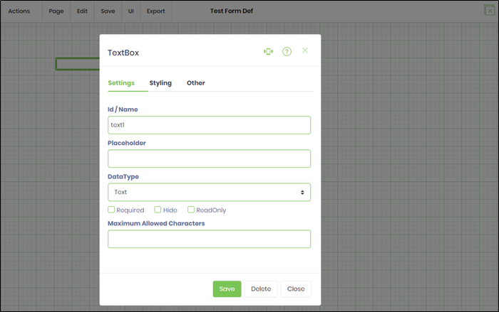
Click on the Help (?) icon to view the PDF Help document for the respective Form Widget control.
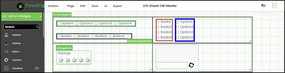
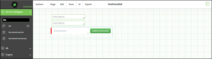
Next, drag two text fields to the form and call them “txtFirstName” and “txtLastName.” Also, drag a text area control for comments as shown below:
Use the Save - Save menu option (or Ctrl + S) to confirm the changes.
Users can also apply styles to the controls by providing the style as shown below:
The form ID and the controls are highlighted on the designer page by hovering the mouse.