Description:
Displays an image on the form.
Inputs
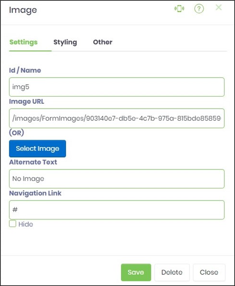
- ID/Name - Name of widget generated by FlowWright (read-only field)
- Image URL - Enter the http URL link
- Alternate Text - Enter description for alternate text
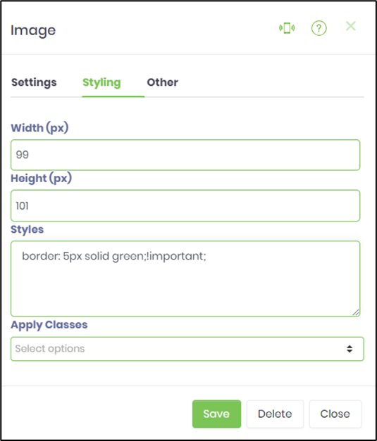
- Width (%) - Enter the percentage value for width
- Height (px) - Enter the pixel value for height
- Hide - Select checkbox to Hide (tick mark)
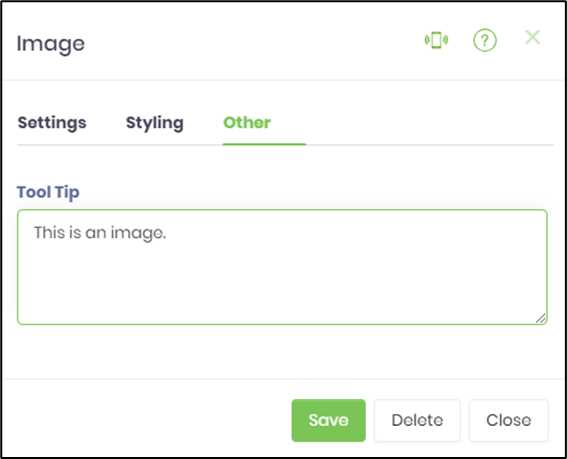
- Tool Tip - Enter information to display on mouse hover on form render
- Styles - Enter the CSS scripts for widget styles
- Apply Classes - Select between custom classes defined
- Save - Save the input values
- Delete - Remove this form widget from the designer page
- Close - Close the input popup window
Design:

Example:
Let’s build and execute the “ImageDef” example.
- Create a new form definition called “ImageDef”
- Select the Open Designer checkbox and click the “Create” button
- Drag a Image widget to the canvas
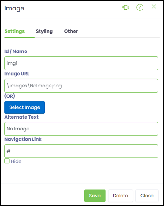
- Double-click on the widget to configure the “Settings” properties. Provide a name to the control. Select the image from the folder. Provide alternate text if necessary. Provide navigation link on click during run time. Select check box to hide the image during run time.
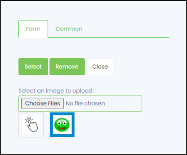
- Click on the Choose Files button to select the image from the local folder.
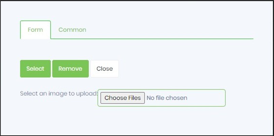
- The image appears as a thumbnail on the popup. You may continue to choose as many image files from the local folder and pick one for selection next.
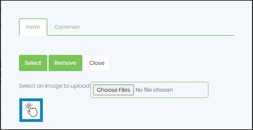
- Click on the SELECT button to associate this picture with the image form control. The image is copied to the application file path as represented by the URL text.
- The selected image is now visible on the image control on the form designer canvas.

- Double-click on the image widget to select / change to another picture by the above procedure.
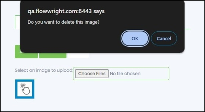
- Select the image thumbnail and click on REMOVE button to delete the picture from the application file path.
- Double-click on the image widget to configure the “Styling” properties. Provide the style script. Select the class from the drop down list if previously uploaded.
- Double-click on the widget to configure the “Other” properties. Provide the tool tip text.
- Click on Save button and Close the popup window
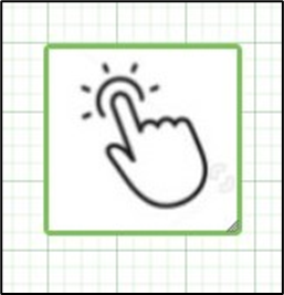
- Navigate to UI menu and Preview the form. The rendered widget will appear as shown in the below graphic