Checkbox Widget

Last published at: May 14th, 2024

Description:

This widget controls let’s you define a list of check boxes for selection. User can select one or many. User can also define a display condition for other widgets on the form.

Inputs

  • ID/Name - Name of widget generated by FlowWright
  • Checkboxes - Define the list of items required as checkboxes (comma suffix an unique value for reference)
  • Display type - Select between Horizontal / Vertical
  • Required - Select checkbox for mandatory (tick mark)
  • Hide -  Select checkbox to Hide (tick mark) 
  • Read Only -  Select checkbox to Read-Only (tick mark) 
  • Allow Select All -  Select checkbox to select / unselect all items 
  • Display Condition - Define a display condition for other widgets based on the checkbox value
  • Styles - Select Label Styles (Bold, Italics, Underline). Select ForeColor and BackColor. Select Font Size. Enter the CSS scripts for widget styles
  • Apply Classes - Select between custom classes defined
  • Tool Tip - Enter information to display on mouse hover on form render
  • Save - Save the input values 
  • Delete - Remove this form widget from the designer page 
  • Close - Close the input popup window

Design:

Example:

Let’s build and execute the CheckboxDef example.  

  • Create a new form definition called “CheckboxDef
  • Select the Open Designer checkbox and click the “Create” button
  • Drag a Text box, Label and a Checkbox widget to the canvas 

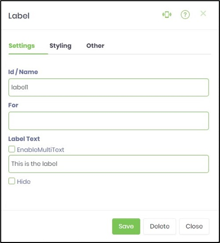
  • Double-click on the Label widget to configure the inputs as shown in the below graphic

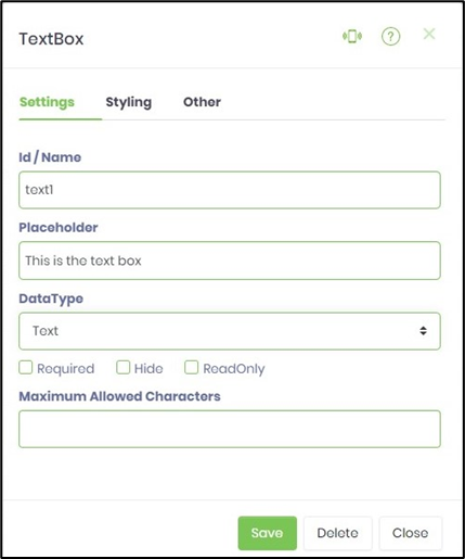
  • Double-click on the Text box widget to configure the inputs as shown in the below graphic

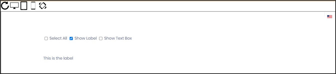
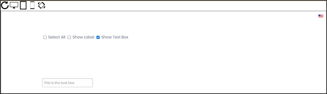
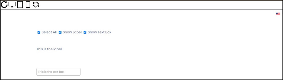
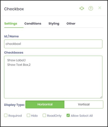
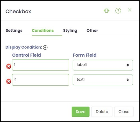
  • Double-click on the Checkbox widget to configure the inputs as shown in the below graphic. Choosing feature "Allow Select All" provides an user to check / uncheck all options during render time.  
  • Click on Save button and Close the popup window
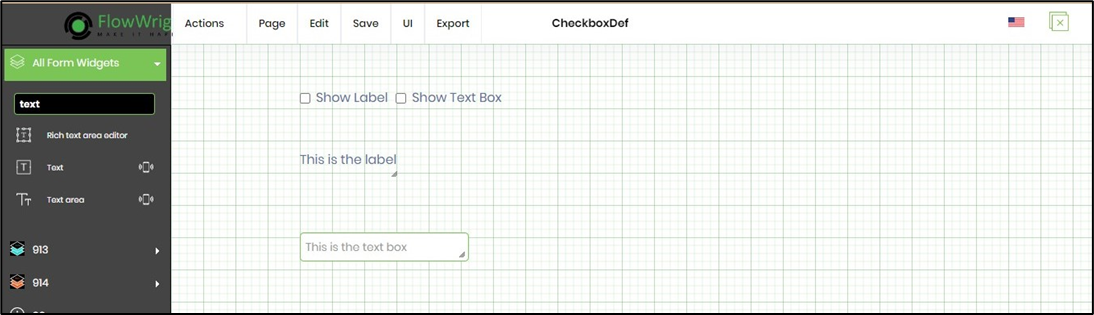
  • Navigate to UI menu and Preview the form. The rendered widget will look as shown in the below graphic