Description:
Displays a list of radio button controls for selection.
Design:
Example:
Let’s build and execute the RadioDef example.
- Create a new form definition called “RadioDef”
- Select the Open Designer checkbox and click the “Create” button
- Drag a Radio widget to the canvas
- Double-click on the Radio widget to configure the inputs as shown in the below graphic

- Click on the Radios field and enter the text values as option values.
- Click on the Default Value field. A default value can be configured using one of the option values.
- Select the Display Type between Horizontal / Vertical
- Select the Display Condition. Enter the option value for the control field. Enter the form field control name.
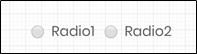
- Navigate to UI menu and Preview the form. The rendered widget provides a list of radio button controls for selection.