Description:
Using the BootstrapGrid container widget, you can create multiple Bootstrap rows and columns and place controls within each column, as demonstrated in the graphic below. You can also insert sub-forms within each Bootstrap column.

Inputs
- FormID - Name of widget generated by FlowWright (read-only field)
- Grid layout - Select between Container and Container-Fluid options
- Border - Select between Solid, Dotted, Dashed, and None options for borderline type
- Background - Select the background color from the palette
- Horizontal Alignment - Left / Center / Right
- Vertical Alignment - Left / Center / Right
- Add Row - Add row before/after the mouse cursor selection
- Add Column - Add column before/after the mouse cursor selection
- Save button - Save the input values
- Delete button - Remove this form widget from the designer page
- Delete Column - Delete the column at the mouse cursor selection
- Delete Row - Delete the row at the mouse cursor selection
- Close button - Close the input popup window
Design:

Example:
Let’s build and execute the “BootstrapGridDef” example.
- Create a Form definition called “BootstrapGridDef.” Navigate to Forms > Definitions in the left pane to create it. On the Form Definitions page, select Actions > Create. Check with your FlowWright administrator if you don't have access to generate Form Definitions.

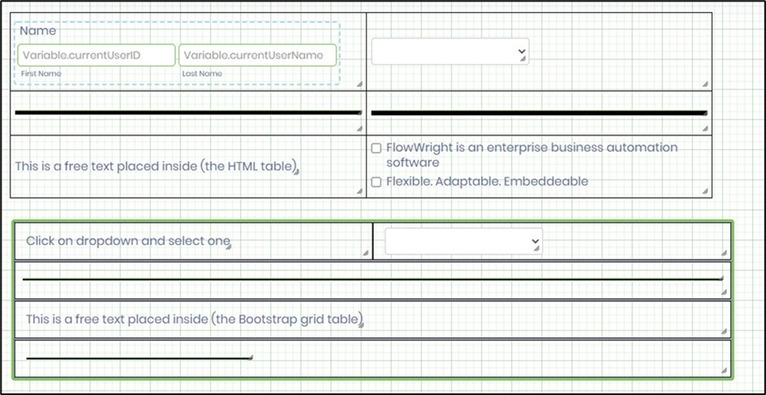
- Drag a "BootstrapGrid, Label, Text, Checkbox, and Submit” control to the canvas and arrange them as shown below.

- Double-click the “BootstrapGrid” widget to configure its “Settings.” The application displays the control's name. Choose the grid layout from the “Container” and “Container Fluid” options. “Container Fluid” expands to fill the display page size when rendered. You may design the grid as a table using the "Add Row" and "Add Column" features. Click the Save button.

- Double-click the “BootstrapGrid” widget to configure its “Styling”. Choose the border style (solid, dotted, dashed, or none) from the drop-down menu. Pick the background color from the color palette drop-down. The selected color applies to the entire table, covering all rows and cells. To change a cell’s background color, right-click the cell and select the color type again from the palette. Adjust the cell’s text alignment using the horizontal and vertical options. Click the Save button.

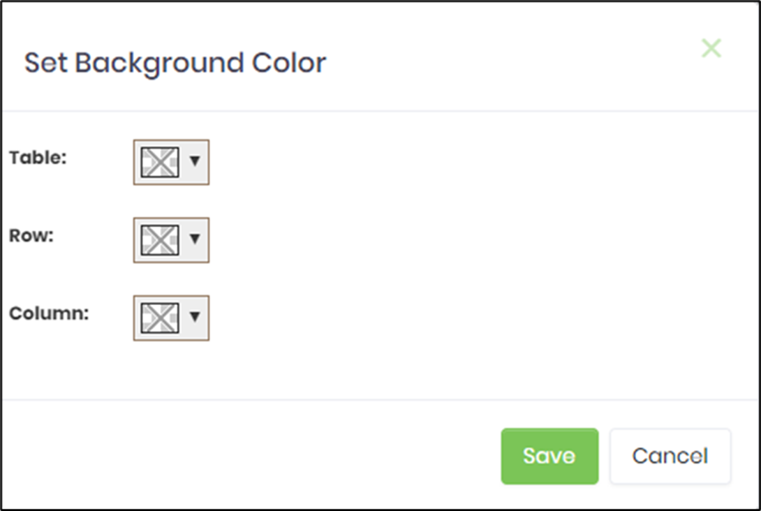
- Another way is to right-click the Bootstrap grid and set the background color for the whole table using the available UI. Choose a color from the dropdown menu and apply it.
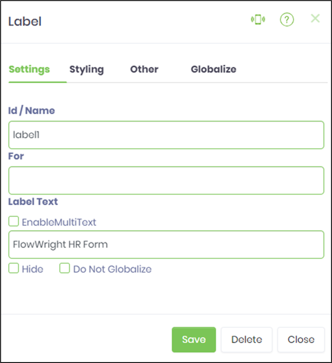
- Drag the label controls as needed and configure them as shown below. Provide a label name and the text to display. Select the “Enable Multi Text” checkbox to display longer text across multiple lines.
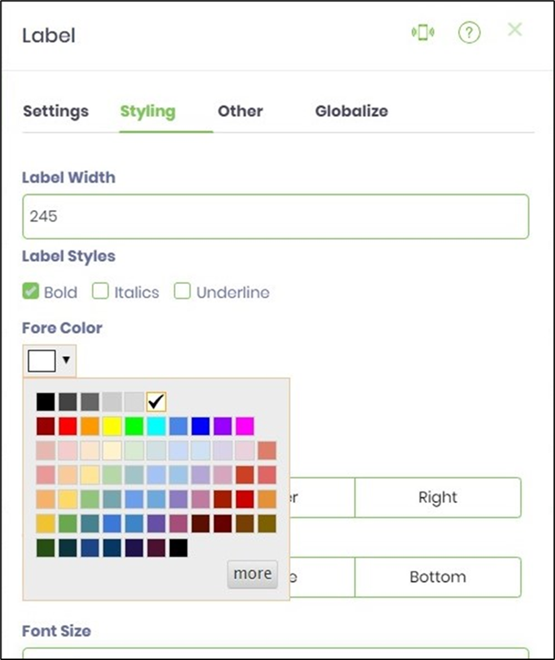
- Choose the Styling tab to set label styles and foreground and background colors.
- Save the Form definition. Then, go to Actions > Create Form Instance to generate a new one. After creating it, select the check box to edit the Form Instance. If you don't have permission to generate Form Instances, consult your FlowWright administrator.

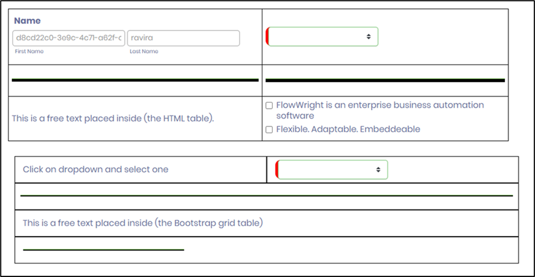
- The Form is shown below. Enter your input and click the Submit button to finish.

- To enhance the visual appeal, add a line widget between rows in the BootstrapGrid container. The Form design view is shown below.
- The displayed Form is shown in the example below.
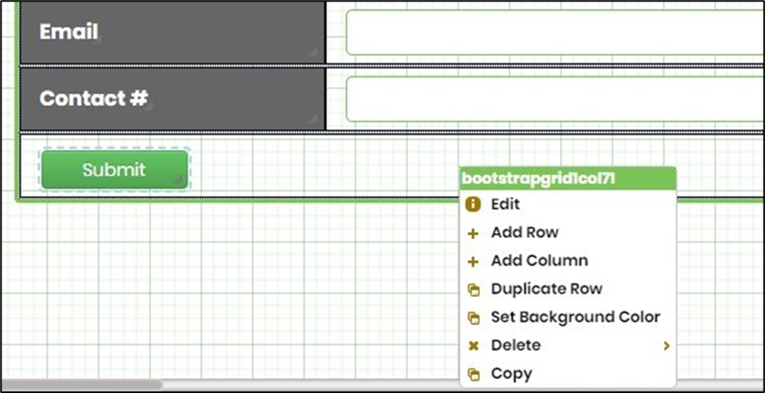
- Right-click the Bootstrap grid to add a row or column, as shown.
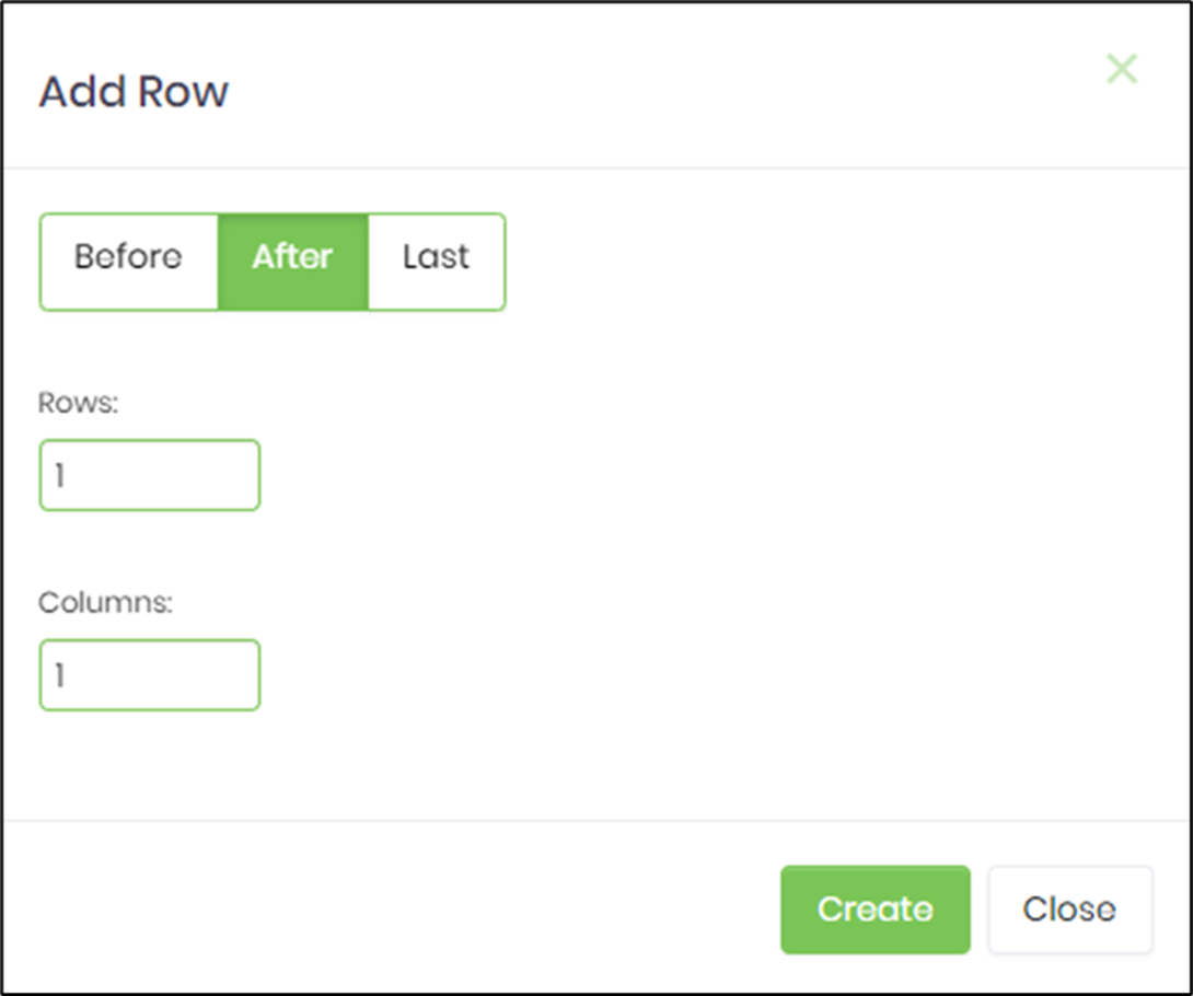
- You can set the new row to be inserted before, after, or at the end of the current row. Enter the total number of rows and columns, then click the Create button to confirm.
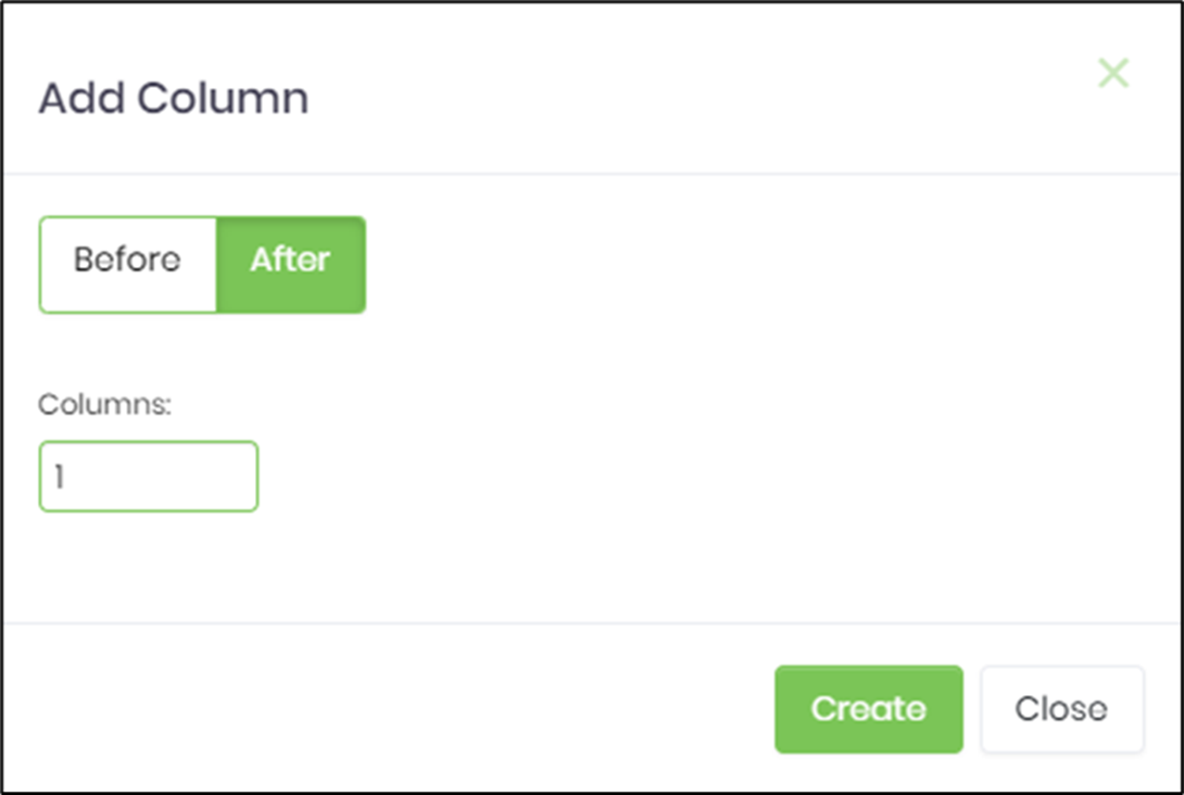
- Set the new column to be inserted before or after the current one. Enter a value for the total number of columns. Click the Create button to confirm the action.
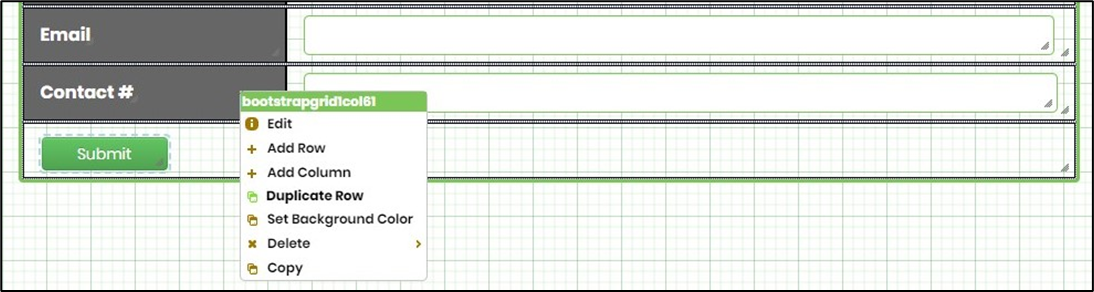
- Right-click the bootstrap table, then use the Duplicate Row option to duplicate the current row.
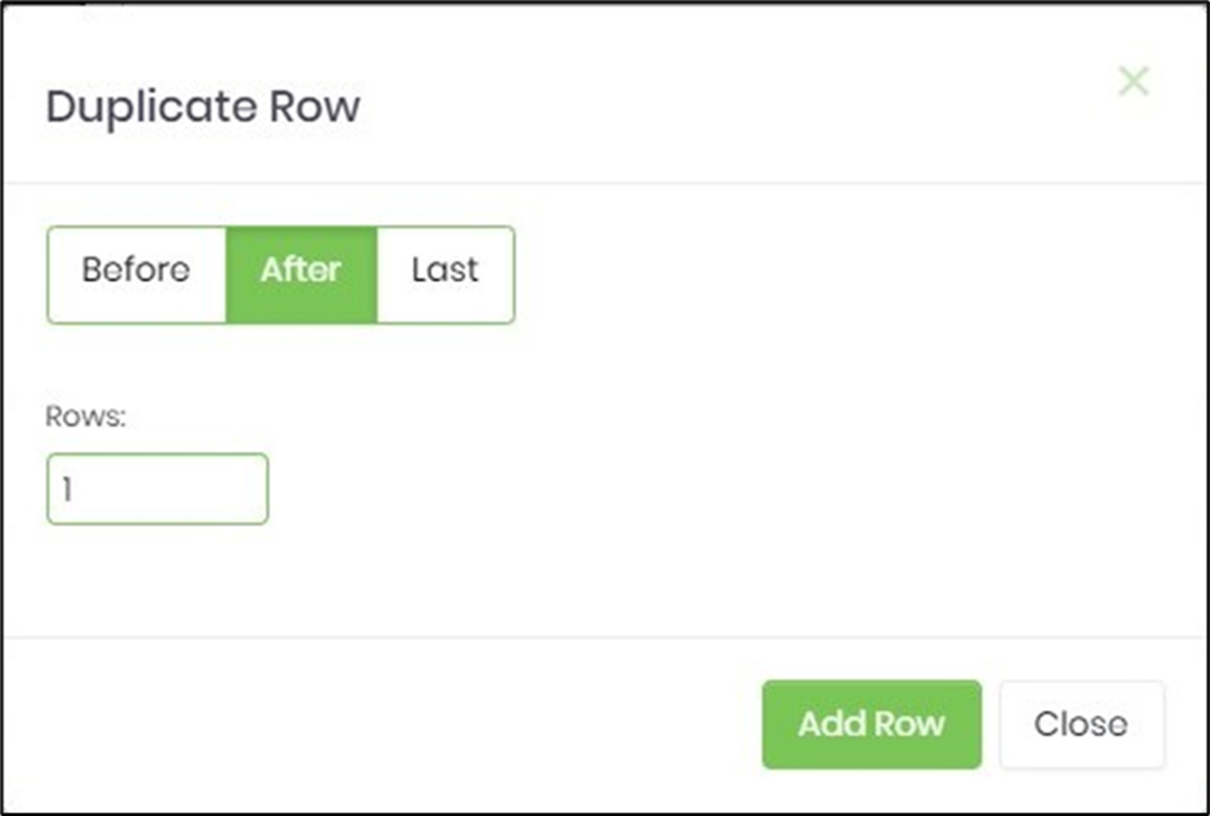
- Select the position to insert the duplicate row. Enter the number of rows to repeat.
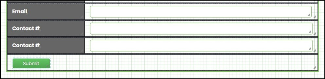
- The duplicate row is placed per the configuration, as shown below.
Definition Sample:
You may download and extract the sample definition(s) from the link provided and later import them (drag-and-drop) into your FlowWright Process Definition (XML file) or Form Definition (HTML file) page.
Note: Please verify and complete the import process steps for any missing configurations, such as file path references and database connections. Then, save the definition to confirm the changes.