This function lets you design dashboard charts for data visualization.
You must navigate to the Manage Config. > Dashboards menu option.

The Manage Dashboard is displayed on a new page, as shown below. Click the Help icon for more information about the context.

How to design a dashboard using System widgets?
Select Actions > Create. A configuration pop-up appears. Enter the dashboard name and display order number. Select the Open Designer checkbox. Click Create to start. The sample reference image is shown below.

The dashboard designer canvas is shown below. The left pane contains the dashboard widgets, categorized as Bar Chart, Line Chart, Numbers, Pie Chart, SQL widgets (Bar, Line, Pie, Numbers), Custom, and System. The top menu bar provides functions to create, edit, remove, save, preview, and export dashboards as XML files. The culture flag in the top-right corner helps translate the text into a different language.
Note: System widgets are preconfigured to fetch specific types of data, including definitions, instances, errors, and other relevant information. Some widgets can be customized with a data connection, an SQL query, and background colors.
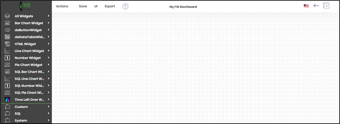
Expand the System category, then drag the Number widgets onto the designer canvas, as shown below. Finally, save the report configuration.

Click UI > Preview to view the dashboard.

The custom dashboard is displayed on a new page, as shown below.

Actions - Menu.

To globalize the dashboard content, select the language from the drop-down list, then click the “Translate” button. The translated text is placed in the empty text boxes, as shown below. A notification appears in the top-right corner. Click the Save button to confirm the changes. Note: The application uses the Azure ML configuration for translation. To set up the configuration, navigate to Status > Settings > Configuration > Azure ML category.

In the Dashboard preview page, select the culture flag from the drop-down list to view the globalization changes.

You can configure the UI theme for Dashboard Widgets using the “Set UI Theme” feature. A pop-up window appears for configuration. Select “Theme colors” or “Custom colors” by clicking the appropriate button. Use the drop-down selection list to choose the heading and body background and text colors. Click the “Set UI” button to confirm the changes. A notification message appears in the top-right corner. The UI Theme changes are applied immediately.

You can enhance the dashboard content by using the “System Variables” feature. A pop-up window displays the available system variables, as shown below.

In this example, a system variable “variable.userFullName” is used with the Dashboard title text, as shown below. Click the Save button.

You can preview the dashboard to view the system variable value, as shown below.

Actions - Save.

Actions - UI.

Actions - Export.

How to design a dashboard using custom SQL widgets with a date filter?
The following SQL custom dashboard widgets are available in the System category.
- SQL Bar Chart
- SQL Line Chart
- SQL Pie Chart
- SQL Number Widget
You may expand the System category and drag the custom bar chart widget onto the designer canvas. Then, as shown below, drag the handles to resize the widget to a larger area. Finally, click the Edit icon in the top-right corner.

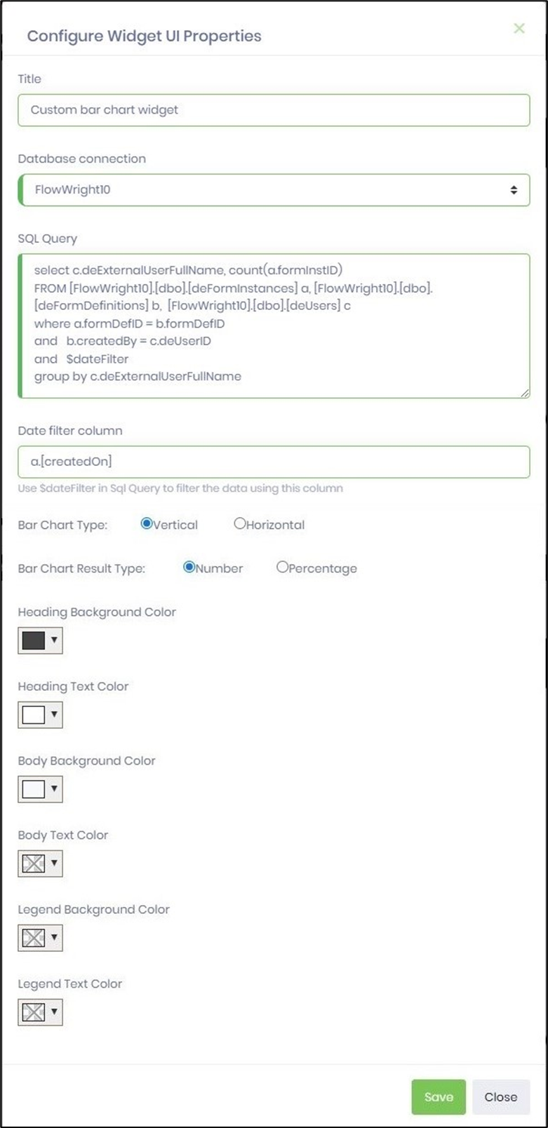
A pop-up window opens for configuration. The sample image is included below for reference. Provide a new title for the chart. Select the database connection from the dropdown list. Provide the SQL query to fetch a result set using the DB connection. Include the custom syntax $dateFilter in the Where condition. Provide the table column name (with an alias if required) in the date filter column field, as shown below. Configure the bar chart orientation as horizontal or vertical. Configure the bar chart result type to display numbers or percentages. Configure the background and text colors. Click to save the configuration.
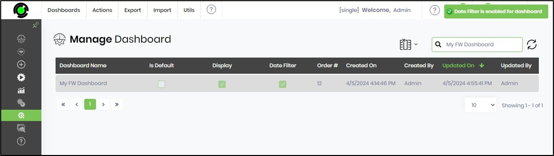
Navigate to the Manage Dashboard page. Select the Utils > Date Filter On/Off option to toggle the date filter.

An alert notification appears in the top-right corner. When the report is generated, the Date Filter is enabled on the dashboard.
Select the Utils > Preview menu option to generate the report.

How do you provide security permissions for a dashboard?
Click the link to understand the security permissions for a dashboard.
How to pass parameters to a dashboard?
Click the link to learn how to render dynamic dashboards.