Description:
Displays a drop down list of choices, these choices could be based on a static list, database call, roles or a look up list category.
Inputs
- ID/Name - Name of widget generated by FlowWright (read-only field)
- Input Size - Select between any of the display size
- Required - Select checkbox for mandatory (tick mark)
- Select Multiple Items - Select checkbox for multi-items select (tick mark)
- Hide - Select checkbox to Hide (tick mark)
- Read Only - Select checkbox to Read-Only (tick mark)
- Data Connection Type - Select between Static, Database, Roles, Lookup
- Options - Enter the values for the preferred data connection type
- Display Condition - Define a display condition for other widgets based on the control field value
- Tool Tip - Enter information to display on mouse hover on form render
- Styles - Enter the CSS scripts for widget styles
- Apply Classes - Select between custom classes defined
- Save - Save the input values
- Delete - Remove this form widget from the designer page
- Close - Close the input popup window
Design:
Example:
Let’s build and execute the “DropdownListDef” example.
- Create a new form definition called “DropdownListDef”
- Select the Open Designer checkbox and click the “Create” button
- Drag a DropdownList widget to the canvas.
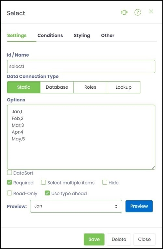
- Double-click on the DropdownList widget to configure the “Settings” properties. Provide a name to the control. Choose the “Data Connection Type” to bind the values to the drop-down list and set any additional properties as necessary to fit your needs. Select “Static” and provide the options as “value,key” format. The “key” is required to configure conditional display if necessary. Select check box to enable data sort the list values, configure as required, select multiple items, use type ahead when selecting from a long list of items, hide or read-only during run time.
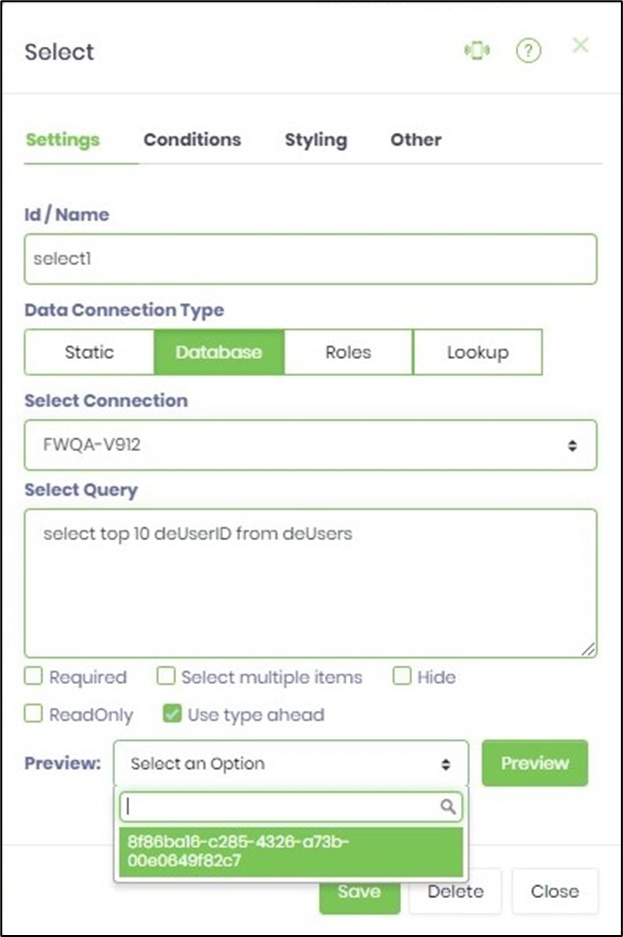
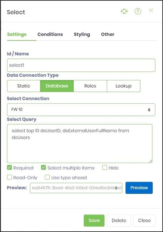
- Double-click on the DropdownList widget to configure the “Settings” properties. Select “Database” and connection type from the drop down list. Provide a SQL Select query. Click on preview button to view results.
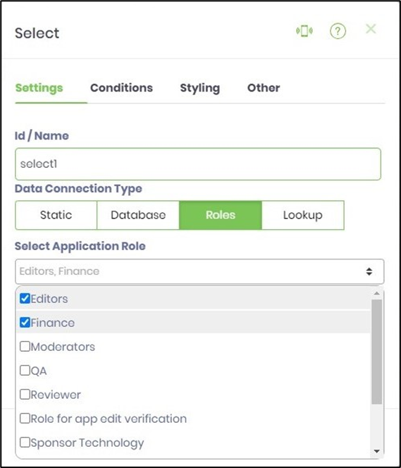
- Double-click on the DropdownList widget to configure the “Settings” properties. Select “Roles” and application roles from the drop down list. The users who belong to the application roles are listed during the run time.
- Double-click on the DropdownList widget to configure the “Settings” properties. Select “Lookup” and lookup category and lookup filter (if available) from the drop down list. The values from the lookup tables are are listed during the run time.

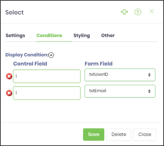
- Click on the “Conditions” tab. Provide the control field value and map with required form field by name to display the control on a condition. Click on the plus sign (+) to add more display conditions. During run time the form controls are displayed when the appropriate checkbox values are selected.
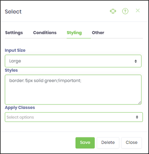
- Click on the “Styling” tab. Select the text box size from the drop down list. Provide the style script. Select the class from the drop down list if previously uploaded.
- Click on the “Others” tab. Provide the tool tip text.

- Click on Save button and Close the popup window
- Navigate to UI menu and Preview the form. The rendered widget will display a drop down list of choices, these choices could be based on a static list, database call, roles or a look up list category.
Note :
- The new version provides Globalization of static drop-down list items in Form Definition. The drop-down values are available in the resource page for translation.
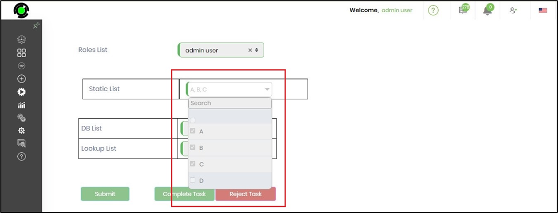
- The widget configured with "readonly" option, provides a list of selected items, on mouse-hover when the form is rendered. The widget in "read-only" mode can still be clicked-open to view the previous selection.
- The widget now provides 'x' feature to remove the user selection for Static, Database, Roles and Lookup options. The Static option should be configured with an empty value for 'x' feature to work.
- The widget's search box stays locked when items are scrolled in run-time.
- The dropdown list in the read-only mode is now clickable - to show all items included the selected ones, as shown in the image below.
- In v9.12 the drop down list have preview button to view the drop down list data.