The custom pie chart widget can fetch data through a database connection and an SQL query, then display a bar chart using the resulting data.
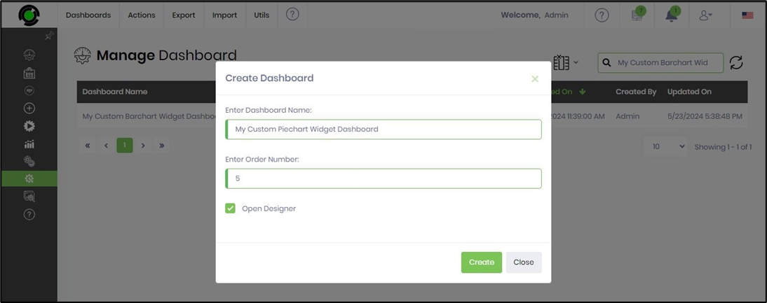
Navigate to the Manage > Dashboards page.

Click the Actions > Create menu option on the Manage Dashboard page to create a new dashboard. You need to provide the dashboard name and display order number.
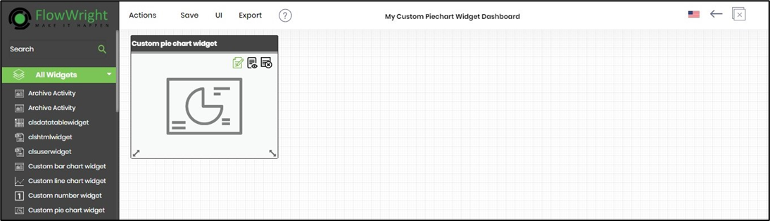
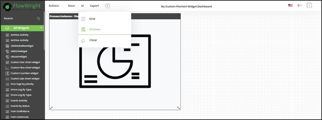
The dashboard designer canvas opens on a new page. Drag the Custom Pie Chart Widget from the toolbox onto the designer canvas. Click the Edit icon to configure it.
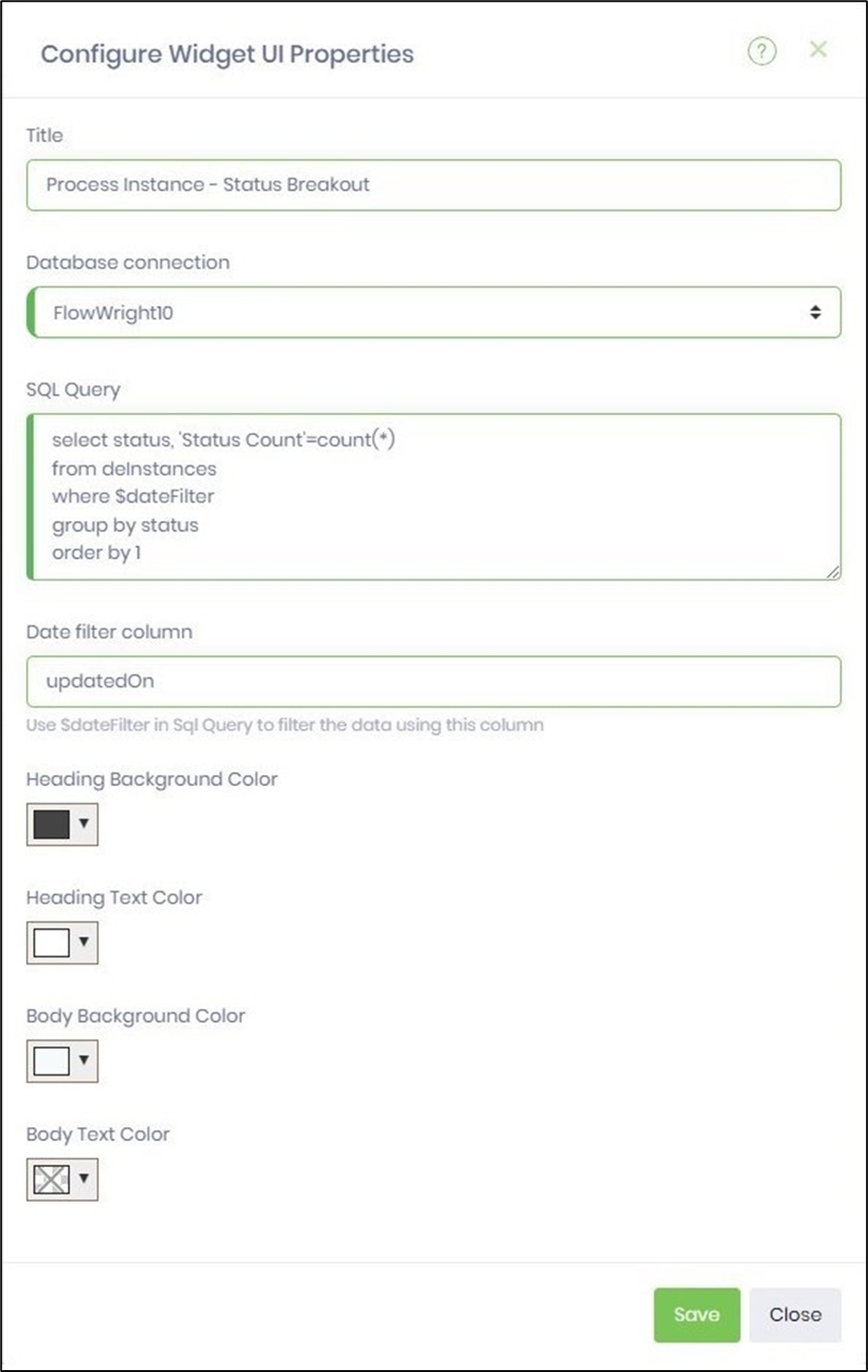
The Configure Widget UI properties are shown in the pop-up window below. Enter the title name. Choose the database connection from the drop-down list. Provide the correct SQL SELECT syntax for the pie chart algorithm. Use the $dateFilter (wildcard syntax) in the WHERE condition and an appropriate date column reference. Select colors from the drop-down list for the chart heading and body text. Click the Save button to apply the changes.
On the dashboard designer canvas, choose the UI > Preview menu to view the dashboard.
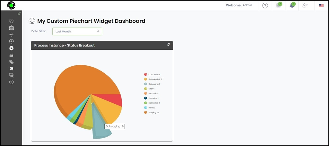
The custom pie chart widget dashboard appears on the new page. Hover your mouse over the bar to see the legend text, and click on the pie to view it in 3D.
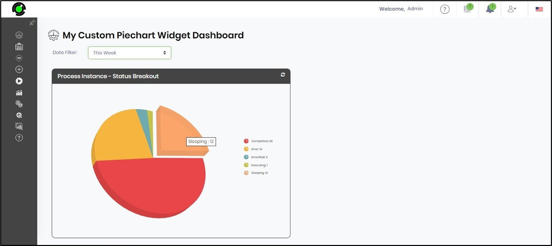
Use the date filter to display the chart on a different timeline. Hover the mouse over the bar to see the legend text, and click on the pie to access a 3D view.
To view the dashboard in the menu pane, select Utils > Show/Hide on the dashboard designer canvas.

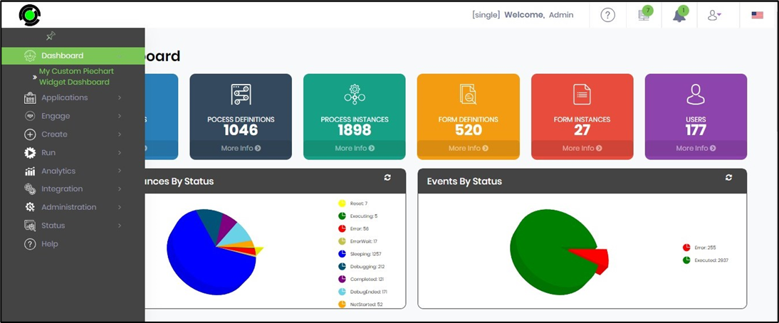
Refresh the FlowWright Dashboard page to see the updated dashboard in the left pane, as shown below.