All the standard widgets have similar, intuitive configuration UI features.
The widget's functionality is already preset. After dragging a standard widget onto the dashboard designer canvas, click the Edit icon to configure its properties.

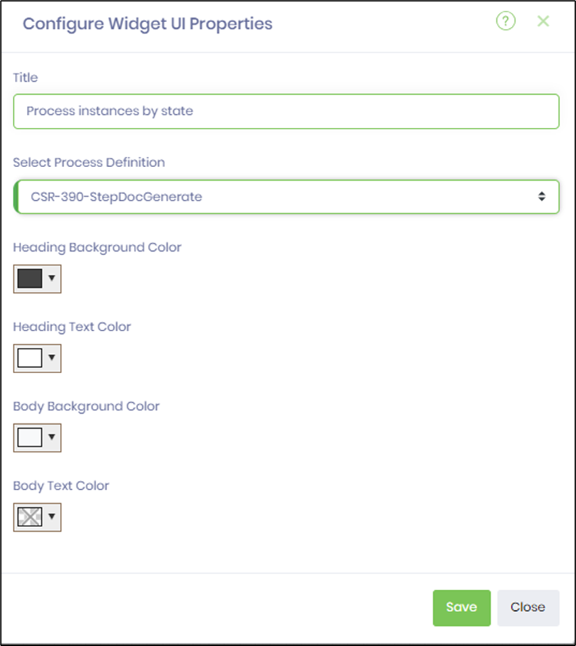
Our UI gives you complete control over your dashboard's look and feel. Enter the title text that best suits your needs. Select colors from the drop-down list for the heading, body, and legend text to customize the widget. Click the Save button to confirm your changes. A confirmation alert appears in the top-right corner, keeping you informed. The help icon (?) link is always available if you need further assistance. Click the Preview icon to verify the widget's functionality. Use the Delete icon to remove the widget from the designer canvas.

Some widgets need a DB connection and an SQL query to work. The SQL query supports HTML syntax, as shown in the example below. Choose the DB connection from the drop-down list. Enter the SQL SELECT syntax. Use the Test Query button to check the SQL query. Provide a reference to a Date column to filter dates. Check the boxes to make the result table responsive and to format the dates.

Some widget UI requires selecting a process definition from the drop-down list, as shown below.
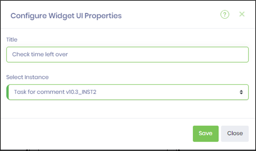
Some widget UI requires selecting a process instance from the drop-down list, as shown below.