Description:
This UI control allows in-place or Form editing with specific functionality. It can also feature columns with links set up to display form instances. This control can only be used once in the form design.
Use a SELECT SQL statement to retrieve records from a single table or create a data table to display the records in a grid. Configure the Form control and route the Form through a workflow that allows a FlowWright administrator to approve row modifications. The SELECT statement can be set up to fetch records from multiple tables, and the grid operates in read-only mode.
With In-place and Form editing of data;
- Specify which fields (columns or rows) are editable or locked.
- Ability to specify customizable controls with complex setup
- Use controls such as text boxes, drop-down menus, checkboxes, and date pickers for editing.
Features:
List
- Bring data from a single database table fulfilling a condition and render data in a table format
- Bring data from multiple database tables and display only, with no add/edit/delete actions
- Bring data from a form data table fulfilling a condition and render data in a table format
- Configuration of a database connection, table, and its columns
- Styling of columns with colors
- Ability to add rows in a single table and form view
- Ability to remove rows in a single table view
- Ability to delete all rows or permit the user to delete their rows
- Ability to edit rows in a single table and form view
- Ability to have non-editable columns, but when adding a row, they are editable
- Ability to save or cancel any row edits
- Warn the user of any unsaved edits
- Reload/refresh the data in the grid view
- Data paging based on the # of rows to display
- Freeze the column headers to view the rest of the grid data
- Ability to sort columns
- Ability to show/hide columns
- Ability to search/filter data on multiple columns
- Ability to select a row
- Ability to select all or multiple rows and to change status (approve), once changed to lock the rows (checkboxes are used to select the rows)
- Ability to lock and unlock the table for editing (similar to form tasks)
- Once the rows are locked, these rows are not editable by the current user (consider locking the rows after approval)
- Once the rows are locked, they should be editable by the following user (here, the following user is the approver)
- Administrative users should be able to edit any row
- Ability to approve single/multiple rows
- Ability to approve the row with a specific value and, thus, have multiple levels of approval
- Ability to display computed summarized column data like totals
- Ability to export all the data on the grid in Excel file format - the file name is formed from the form instance with support to Swedish alphabets
- Ability to audit trail all row updates / delete / approvals to [deEditGridDataAudit] SQL table
Design:
Example:
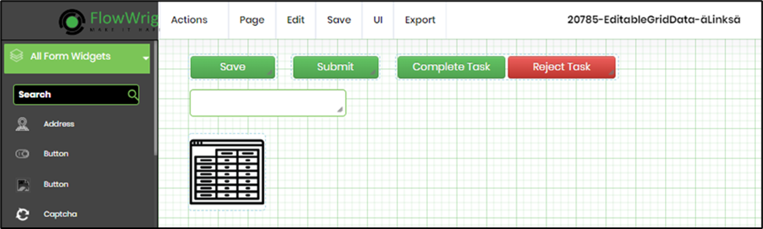
Let’s build and execute the “EditGridDataTableDef” example.
- Create a Form definition called “EditGridDataTableDef.”
- Drag the “BootstrapGrid, Save, Submit, FormApproval, and EditGridData” controls onto the canvas and arrange them as shown below.

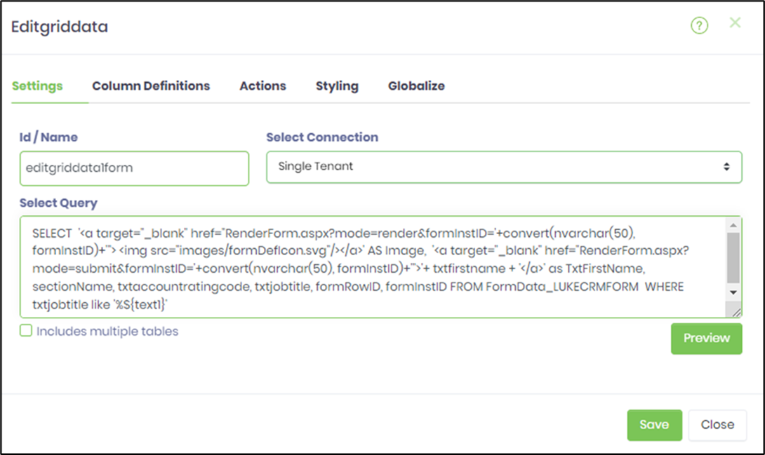
- Double-click the “EditGridData” widget to configure its “Settings” properties. Provide a name for the control. Select the database connection from the drop-down list. Enter the Select SQL query as shown below. Check the box if the Select SQL query joins multiple tables. Click the “Preview” button to view the SQL result set. Click the Save button.

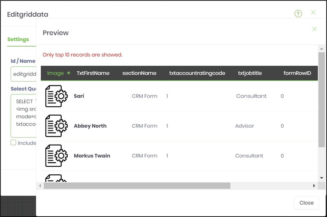
- The preview pop-up window appears below.

- Double-click the “EditGridData” widget to set up the “Column Definitions” properties. This tab allows you to configure the following:
- Add multiple column definitions.
- Modify a column definition.
- Remove a column definition.
- Rearrange or order the column definitions.
- Create another Form definition called “EditableGridDataControls.” This Form is necessary because it contains the Form controls and their values for the grid.
- Configure the Form definition using widgets such as text boxes, checkboxes, date pickers, and dropdown controls.
- Inline Editing lets users modify content directly inline. Form Editing enables users to adjust form data in a pop-up window. This feature allows editing of multiple data columns using the form's vertical scroll. By default, the Inline Editing button is focused.
- Double-click the “EditGridData” widget to set up the “Column Definitions” properties. Choose the Form definition from the drop-down list that contains the grid controls. Click the “Inline Edit or Form Edit” style button. Click the plus sign (+) to add an empty row. Select the column name from the drop-down list and type a display name in the text box. Pick the “key field” from the drop-down list to update or delete the row in the grid. Drag and drop the fields vertically to change their order. A summary label is needed when any column checkboxes are selected. Based on the column settings, the summary row will calculate the SUM of each column and show the value as read-only text. When row data changes, the summary row will automatically update in real time. A field appears read-only at runtime when its widget is set as read-only. An editable field depends on the input data type and size, reflecting its control widget setup.

- Configuring the Form Editing feature will display the UI as shown below. You can move the row items up or down by dragging and dropping them. Set the database table name reference.

- The Form definition is set up in advance with widget controls such as text boxes, checkboxes, date pickers, and drop-down menus. The widget configurations can be marked as required or read-only and can accept specific data types and sizes as inputs.

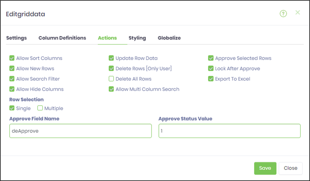
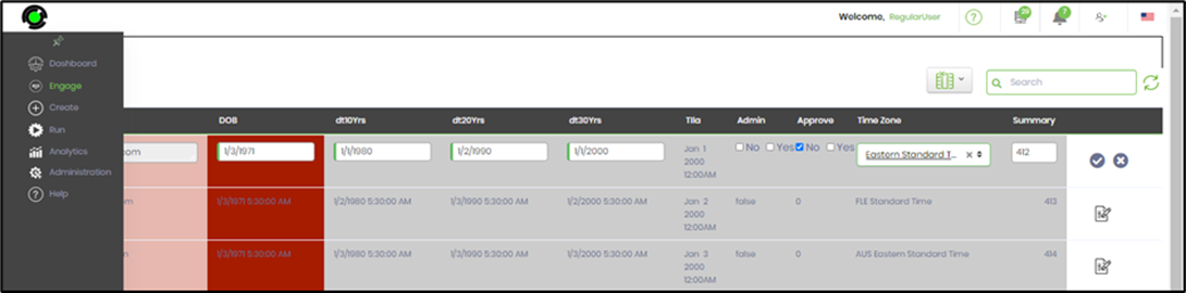
- Configure the actions according to the graphic below. Select the appropriate checkboxes to specify the behavior of the EditGridData table during execution. When the row is approved at runtime, the flag is set to 1. The FlowWright Admin user has all action privileges, regardless of the configuration here.
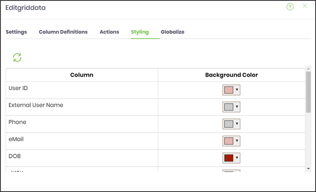
- In the Styling tab, choose the colors for the columns. Then click the Refresh icon to load the columns initially.
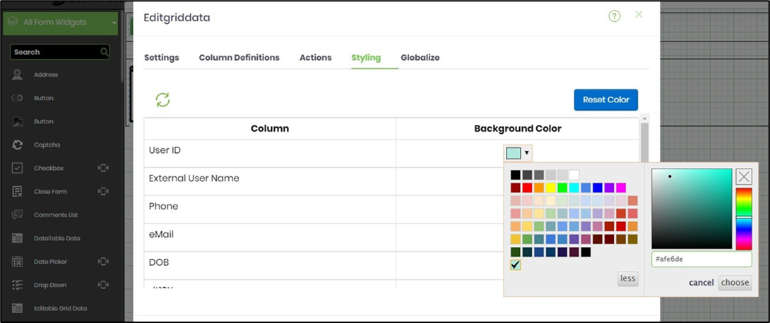
- Customize column colors using the #hex code.
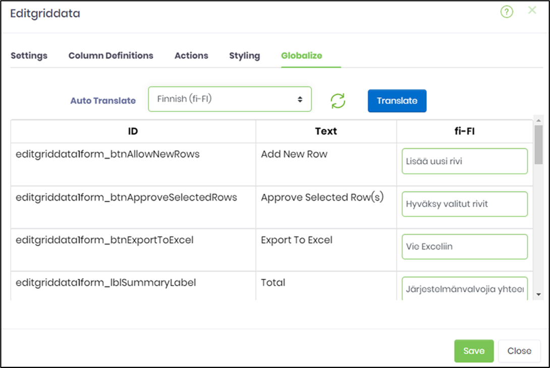
- Globalize the Form as shown below. Select the language culture from the drop-down menu.
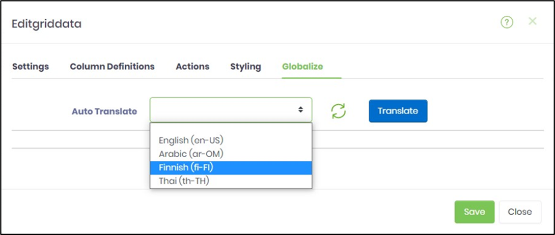
- Click Translate, then click the Save button.
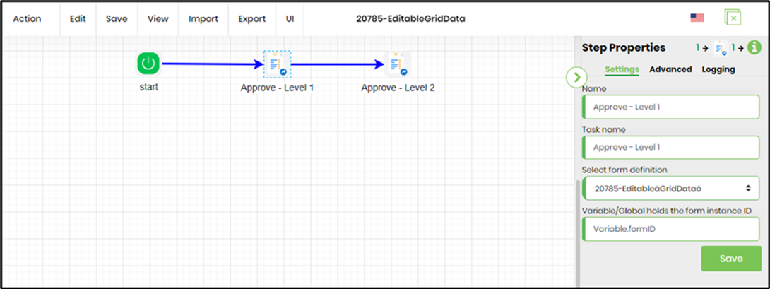
- Create a process definition to route the EditGridData form, as shown below.
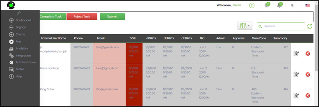
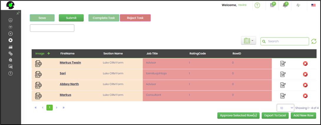
- Save the process definition, create a process instance, execute it, and then render the task to view the EditGridData form.
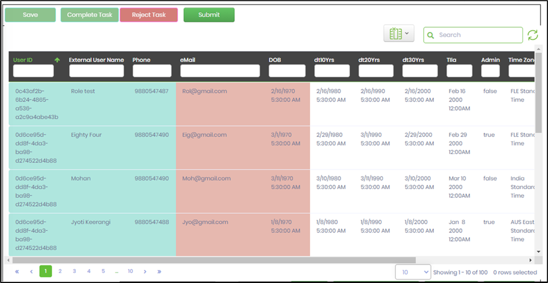
- Save the process definition, create a process instance, execute it, and then display the task to view the EditGridData form.
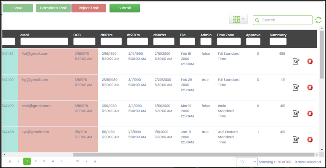
- Click the modify icon to edit the record. For inline editing, the fields become editable and require specifying data types and size information, as defined in the widget configuration mapped during design. Click the save icon (checkmark) to confirm the changes.

- Click the modify icon to edit the record. The fields become editable in Form Editing mode and require specific data types and size information, as configured during design. Click the Save button.

- The privileges for regular users (non-admins) depend on the ACTION configuration set during design. Changes can also be restricted to the record created by the user. An audit trail runs in the background, recording all modifications.
- Click the “Select All” button to quickly select every row.
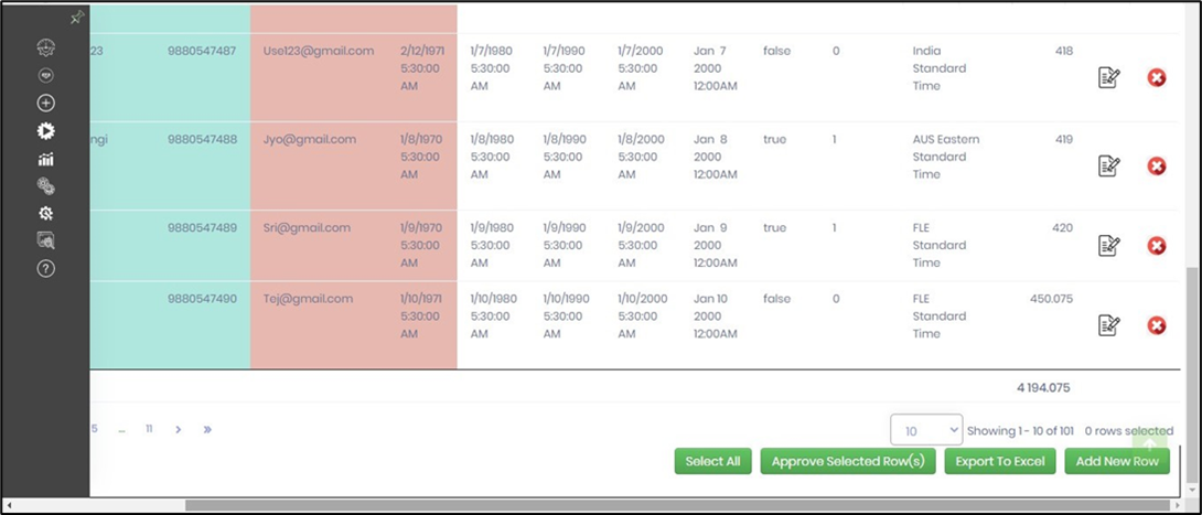
- Click the “Unselect All” button to quickly clear all selected rows.
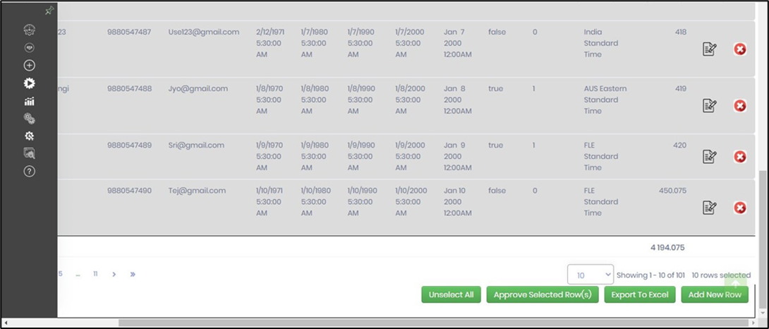
- Select one or more rows, then click the “Approve Selected Row(s)” button. The selected rows are marked as approved with a flag. Approved rows may be locked based on the configuration.
- The Admin user's privileges override the ACTION configuration set during design. The Admin user can modify the grid data as needed. An audit trail records row updates, deletions, and approvals. Audit records are stored in the SQL table [deEditGridDataAudit].
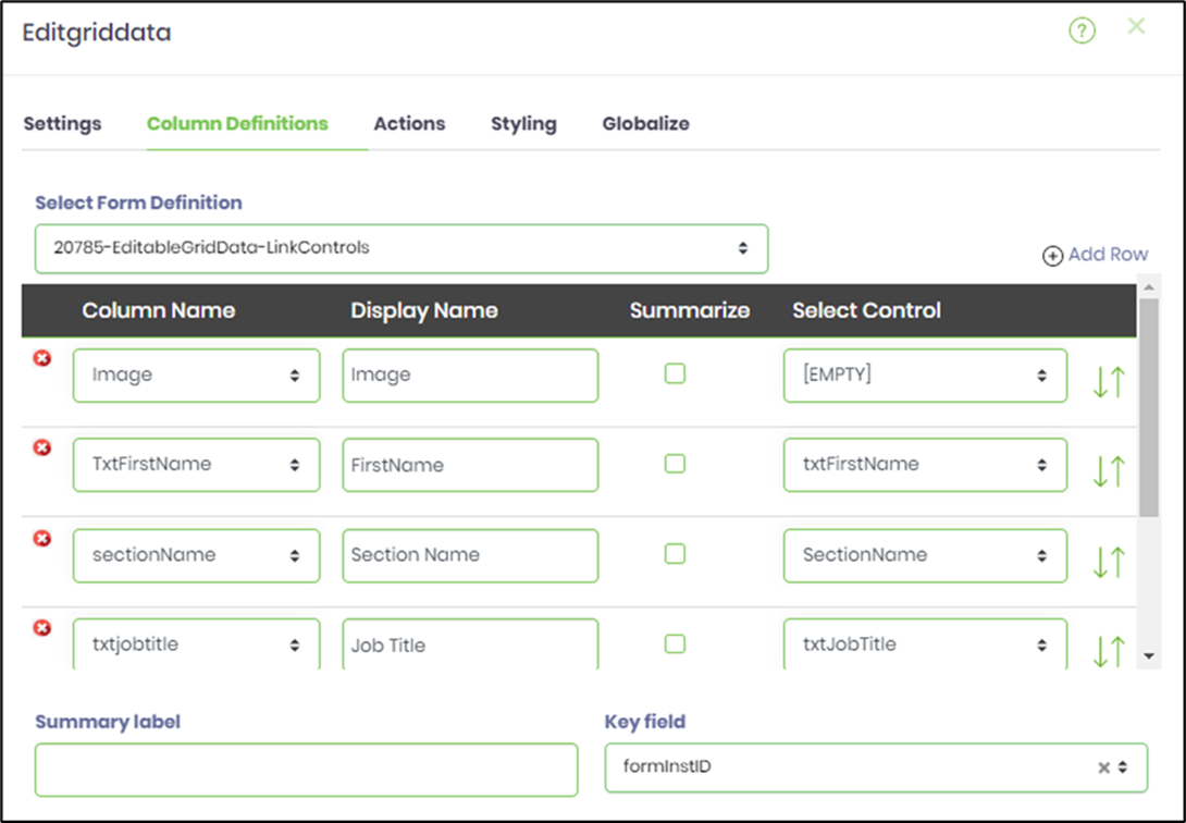
- EditGridData can include columns with links configured to display form instances. It can also reference a text box value that filters the data. To do this, use the “Settings” tab to configure the SQL statement tab, as shown below.
- A sample code reference is provided here for easy modification by copying and pasting.
SELECT '<a target="_blank" href="RenderForm.aspx?mode=render&formInstID='+convert(nvarchar(50), formInstID)+'"> <img src="images/formDefIcon.svg"/></a>' AS Image, '<a target="_blank" href="RenderForm.aspx?mode=submit&formInstID='+convert(nvarchar(50), formInstID)+'">'+ txtfirstname + '</a>' as TxtFirstName, sectionName, txtaccountratingcode, txtjobtitle, formRowID, formInstID FROM FormData_LUKECRMFORM WHERE txtjobtitle like '%${text1}'
- A sample code reference is provided here for quick editing by copying and pasting.
- The links are created using standard HTML tags. A reference to the image is possible if the resource is located in the FlowWright\Image folders. Click "Preview" to view the SQL statement, as shown below. By default, only the top 10 records are displayed in the result sets.
- Configure the Column Definitions as shown in the graphic below. The image column should be mapped to the "EMPTY" control in the dropdown. In this example, the hyperlink column is mapped to an editable control, but it can be set to read-only in the Form design view if needed. The "key-field" feature enables row updates or deletions and should always be mapped to a unique column.
- Save the process definition, create a process instance, and run it. Then display the task to view the EditGridData form. Finally, click the image or the first name link to display the Form Instance.
Definition Sample:
You may download and extract the sample definition(s) from the link provided and later import them (drag-and-drop) into your FlowWright Process Definition (XML file) or Form Definition (HTML file) page.
Note: Please verify and complete the import process steps for any missing configurations, such as file path references and database connections. Then, save the definition to confirm the changes.