Show/Hide toolbox.
When working with forms, to maximize the workspace, you can hide or show the toolbox using the menu item “Actions > Toolbox”.
Here's a Form Designer with a toolbox pane on the left. You need to go to the Actions > Toolbox menu option to toggle the show/hide attribute.

When the toolbox is in hide mode, more space becomes available on the form designer canvas.

Grid view.
The forms designer offers a grid view to assist in positioning and aligning controls. The menu item “Actions > Grid” conveniently toggles the Grid view on and off.
Here's a form designer with a grid pane visible in the background. To toggle the show/hide attribute, go to the Actions > Grid on/off menu option.

The Form Designer is rendered with no grid pane in the background.

Set Grid.
The “Set Grid” option allows you to select the grid size in the Form Designer. Click the “Set Grid” menu item to choose the grid size as shown below:

Enter the grid size value and click the “Set” button to confirm. The new grid size updates in the background.

System Variables.
The “System Variables” option shows a list of variables available in the form. Select a label and edit its property to “variable.createdOn”, which displays the current date during runtime.

A pop-up displays the list of system variables. Click here to understand more about system variables.

Process Variables.
Through the “Process Variables” functionality, the user can view the variables and globals of a process definition.

A pop-up is displayed for configuration. Select the process definition from the list to view its “variables and globals”.

Show/Hide controls.
Through the “Show / Hide / Required” feature, the user can “hide” or make form widget controls “read-only” or “required.”
You must navigate the Actions > Show/Hide/Required menu option.

A pop-up is displayed with the Show / Read Only / Required options shown below. Empty check boxes indicate no form field configuration, while checked boxes suggest that the form field is set to hide, read-only, or required. These attributes can be managed from the pop-up window, and they are visible during form execution.

Set Tab Indexes.
Through the “Set Tab Indexes” feature, the user can configure the tab navigation between form fields.

The user can set indexes for the tabs or have them start automatically at 1. Form controls can be arranged in the preferred order, and an auto-indexing feature is also available.

Snapshot Management.
Use the “Snapshot Management” option as a version control and backup system. It allows you to capture the exact state of a form and its associated data at a specific moment in time. Click here to understand more.

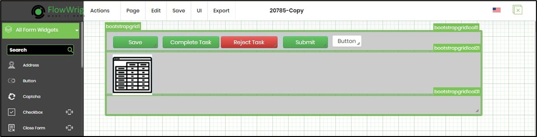
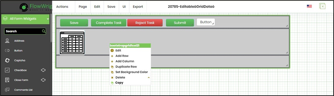
Copy - Paste between Form Definitions.
The user can copy and paste form controls between Form Definitions opened in different tabs on the same browser, provided that the form controls in the target environment have unique names. When a form control name conflicts with an existing control of the same type in the target form, the control names are either retained or changed accordingly. The form control configurations are also copied.
Here's a form control copied from the source to the clipboard.
Here, the form control is pasted onto the designer canvas.
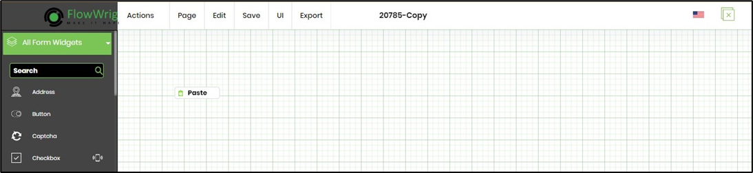
The Form control is copied to the target form designer canvas (as long as the source and target definition pages are open in the same browser session).