Description:
This is a form UI control that provides a in-place editing of data with certain level of functionality. This form UI control can have columns with links configured to render form instance also. This form UI control can be used only once on the form design.
Use a SELECT SQL statement to fetch records from a single table / form data table and display them in a grid. Configure the form control, route the form through a workflow where a FlowWright administrator can approve the row modifications.The SELECT statement can also fetch records from multiple tables and the grid behaves in read-only mode.
With In-place editing of data;
- Define what fields (columns, rows) can be modified or not
- Ability to define editable controls with complex configuration
- Use (text box, drop down, checkbox, date picker) controls for editing
Features:
List
- Bring data from a single database table fulfilling a condition and render data in a table format
- Bring data from multiple database tables and display only, with no add/edit/delete actions
- Bring data from a form data table fulfilling a condition and render data in a table format
- Configuration of a database connection, table and its columns
- Styling of columns with colors
- Ability to add rows in single table view
- Ability to remove rows in single table view
- Ability to delete all rows or permit user to delete their own rows
- Ability to edit rows in single table view
- Ability to have non-editable columns, but when adding a row they are editable
- Ability to save or cancel any row edits
- Warn the user of any unsaved edits
- Reload/refresh the data in the grid view
- Data paging based on the # of rows to display
- Freeze the column headers to view the rest of the grid data
- Ability to sort columns
- Ability to show/hide columns
- Ability to search/filter data on multiple columns
- Ability to select a row
- Ability to select all or multiple rows and to change status (approve), once changed to lock the rows (check boxes are used to select the rows)
- Ability to lock and unlock the table for editing (similar to form tasks)
- Once the rows are locked, these rows are not editable by the current user (consider locking the rows after approval)
- Once the rows are locked, should be editable by next user (here the next user is the approver)
- Administrative users should be able to edit any row
- Ability to approve single / multiple rows
- Ability to approve the row with a specific value and thus, have multiple levels of approval
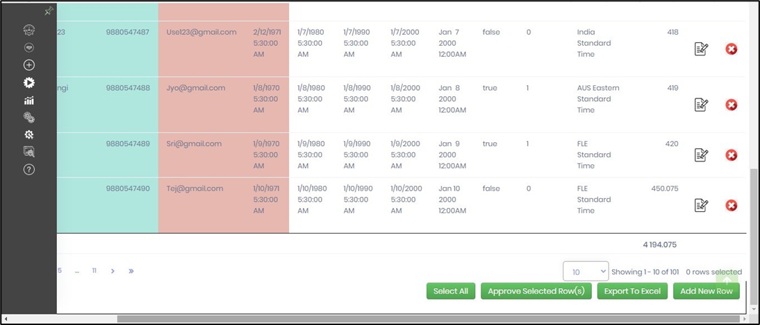
- Ability to display computed summarized column data like totals
- Ability to export all the data on the grid in Excel file format - the file name is formed from the form instance with support to Sweddish alphabets
- Ability to audit trail all row update / delete / approvals to [deEditGridDataAudit] SQL table
Design:

Example:
Let’s build and execute the “EditGridDataTableDef” example.
- Create a new form definition called “EditGridDataTableDef”
- Select the Open Designer checkbox and click the “Create” button
- Drag a EditGridData form widget to the canvas. Drag the form save, submit and approve buttons also.

- Double-click on the widget to configure the inputs as shown in the below graphic
- Use the Settings tab to configure the Select SQL statement tab and the DB connection. Configure the connection string in the Integration - Connections menu prior.
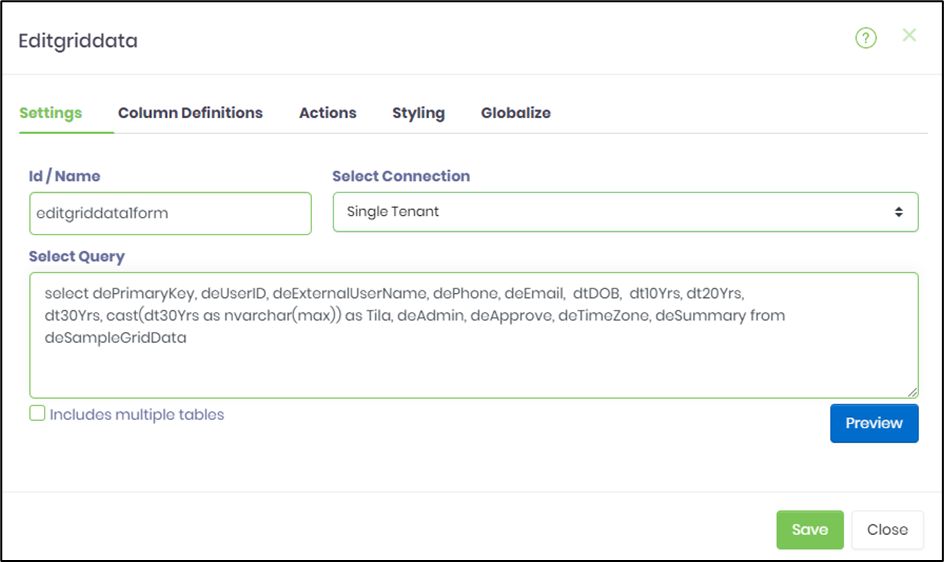
- Click on the check-box "multiple tables" if the SQL statement is referring to many tables. The EditGridData table behaves in read-only mode with check-box enabled. Click on the preview to view the top 10 records.

- Configure the Column Definitions as shown in the below graphic. Column definition configuration lets you configure the following:
- Add any number of new column definitions
- Modify a selected column definition
- Remove a selected column definition
- Order/rearrange the column definitions
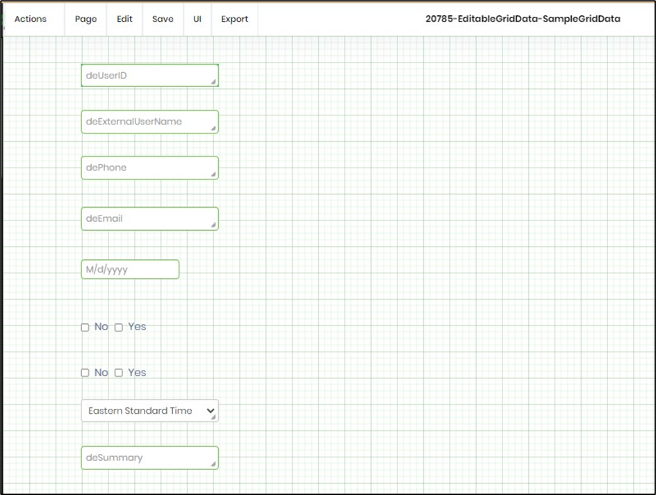
- Select the form definition to configure widgets like textbox, checkbox, datepicker and dropdown controls. Each column, desired to be displayed, should be mapped with an appropriate widget control. Use the "Add row" feature to map the selected columns to their form definition widgets. Use the unique column, to map to the "key-field" feature, to help update or delete the row. Drag and drop the fields vertically to arrange their order. A summary label info is required when any of the column check-boxes is selected. Based on the column definition settings, the summary row will compute the SUM of each column and display the value as text (read-only). When row data is changed, the summary row will automatically update the summary data in real-time. During runtime, a field appears read-only when its widget is configured as read-only. An editable field is mandated by the input data type and size, based on its control widget configuration.
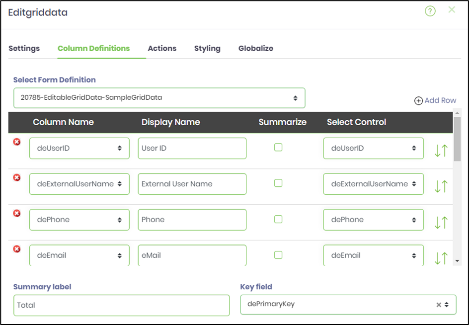
- The form definition is configured before hand with the widget controls like textbox, checkbox, datepicker and dropdown. The widget configurations can be defined as required, read-only, accept certain data-type and size, as its inputs.
- Configure the Actions as shown in the below graphic. Select appropriate check-boxes to define the behaviour of the EditGridData table during execution. A flag value 1 is captured when the selected row is approved during run-time. FlowWright Admin user have all action privileges irrespective of the configuration done here.

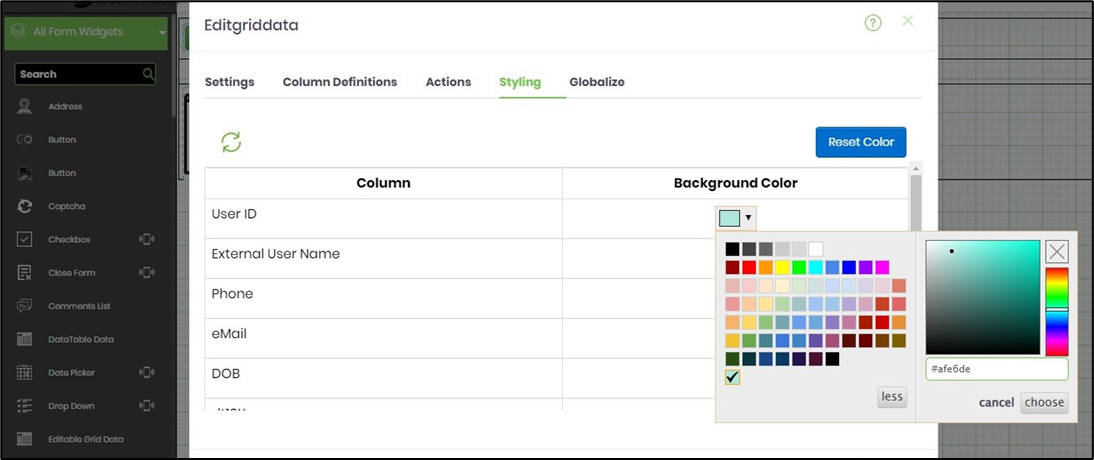
- Select colors for the columns in the Styling tab. Click on the Refresh icon to load the columns the first time.
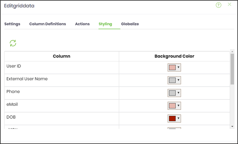
- Customize the column colors by refering the #hex code.
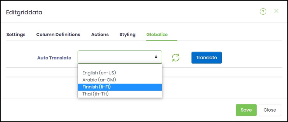
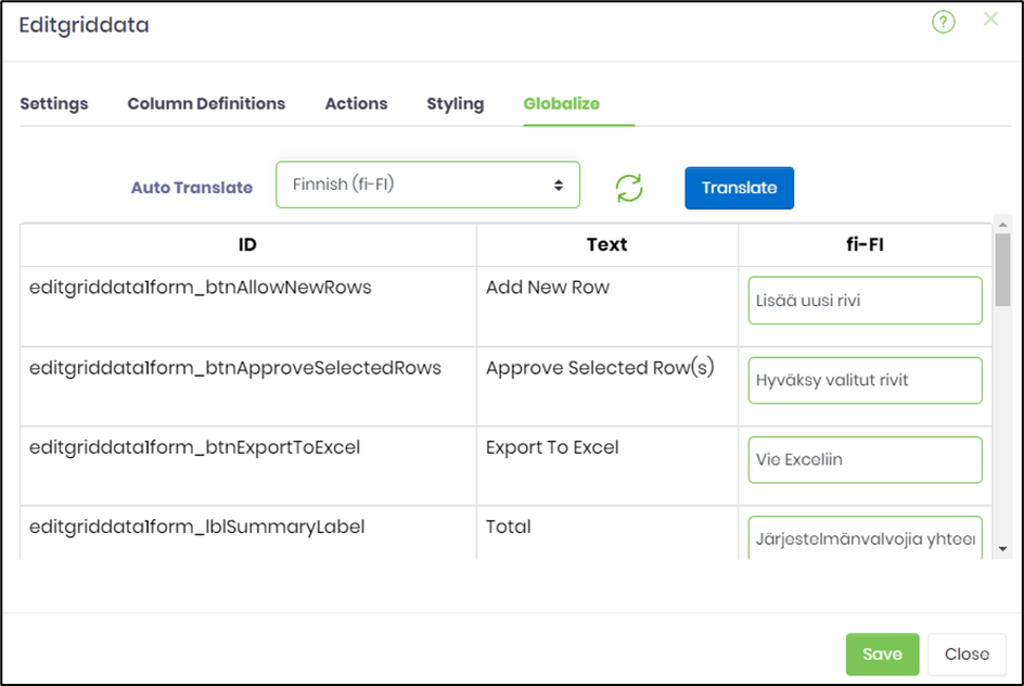
- Globalize the form as shown in the below graphic. Select the language culture from the drop-down. and click on Translate. Click on Save to confirm the changes.
- Create a process definition to route the EditGridData form as shown in the below graphic.

- Save the process definition, create a process instance and execute. Render the task to view the form EditGridData.
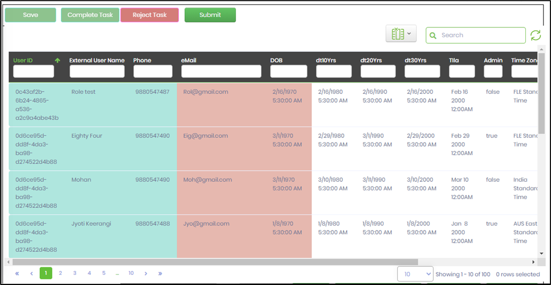
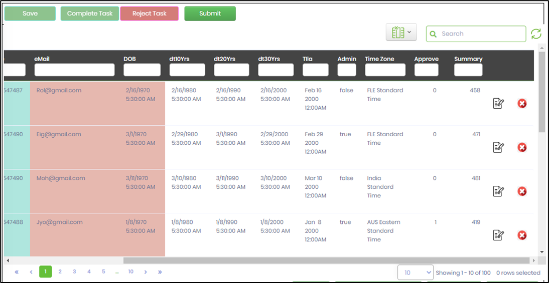
- Click on the modify icon to edit the record. The fields appears editable and shall mandate certain data type and size information as input, as per the widget configuration mapped during design. Click on save (tick icon) to confirm the changes.
- The privileges for the regular user (non-admin) depends on the ACTION configuration mapped during design. The modifications can also be limited to only the record created by the user. An audit trail facility runs in the background taking note of the changes done.
- Click on Select All to mark all rows as selected quickly.
- Click on Unselect All to unmark all rows quickly.
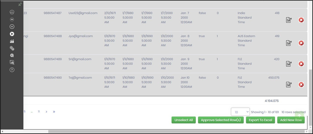
- Select single or multiple rows and click on Approve selected rows.The rows are marked approved with the flag value. The approved rows may be locked as per the setting.

- The privileges for the Admin user over-rides the ACTION configuration mapped during design. The admin user may modify the grid data as necessary. An audit trail feature tracks the row updates, delete and approvals. The audit records are stored in SQL table [deEditGridDataAudit].
- The EditGridData can have columns with links configured to render form instance. The EditGridData can also refer a text box value to filter the data. To do this, use the settings tab to configure the Select SQL statement tab as shown below. A sample code reference is provided here to copy-paste for quick modifications.

SELECT '<a target="_blank" href="RenderForm.aspx?mode=render&formInstID='+convert(nvarchar(50), formInstID)+'"> <img src="images/formDefIcon.svg"/></a>' AS Image, '<a target="_blank" href="RenderForm.aspx?mode=submit&formInstID='+convert(nvarchar(50), formInstID)+'">'+ txtfirstname + '</a>' as TxtFirstName, sectionName, txtaccountratingcode, txtjobtitle, formRowID, formInstID FROM FormData_LUKECRMFORM WHERE txtjobtitle like '%${text1}'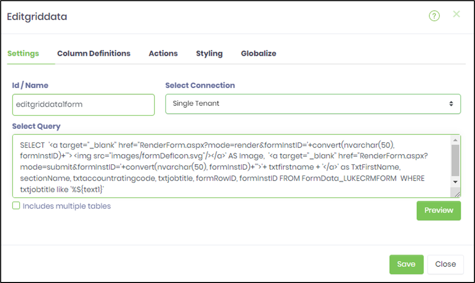
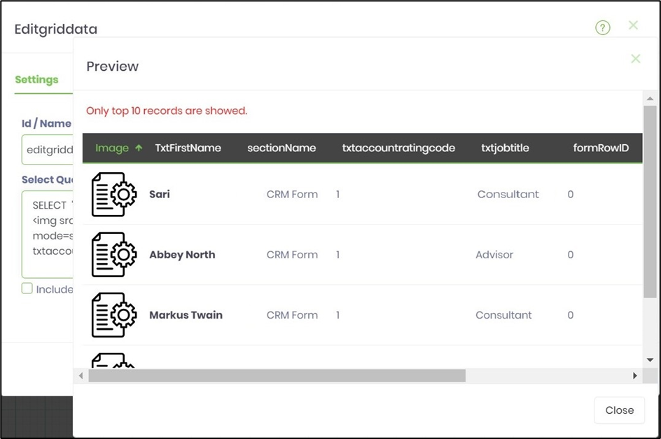
- The links are constructed using regular HTML tags. A reference to image is possible if the resource is located within the FlowWright\Image folders. Click on "Preview" to view the SQL statement as shown below. By default, only top 10 records are displayed as resultset.
- Configure the Column Definitions as shown in the below graphic. The image column should be mapped to "EMPTY" control in the dropdown. The hyperlink column is seen mapped to an editable control in this example and this can be configured as read-only in the form design view if required. The "key-field" feature, helps update or delete the row and this should be mapped to unique column always.

- Save the process definition, create a process instance and execute. Render the task to view the form EditGridData. Click on the image or the first name link to render the form instance.
