Description:
Validates the form and its controls
Inputs
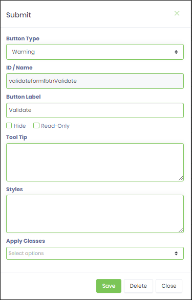
- Button Type - Select any of the button types (Default, Primary, Info, Success, Warning, Danger, Inverse)
- ID/Name - Name of widget generated by FlowWright (read-only field)
- Button Label - Enter the description text for the button label
- Hide - Select checkbox to Hide (tick mark)
- Read Only - Select checkbox to Read-Only (tick mark)
- Tool Tip - Enter information to display on mouse hover on form render
- Styles - Enter the CSS scripts for widget styles
- Apply Classes - Select between custom classes defined
- Save - Save the input values
- Delete - Remove this form widget from the designer page
- Close - Close the input popup window
Design:
Example:
Let’s build and execute the “ValidateFormDef” example.
- Create a new form definition called “ValidateFormDef”
- Select the Open Designer checkbox and click the “Create” button
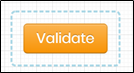
- Drag a ValidateForm widget to the canvas
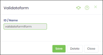
- Double-click on the ValidateForm widget to view the input / properties. The popup window will appear as shown in the below graphic
- Double-click on the Validate button widget to configure the inputs as shown in the below graphic
- Click on Save button and Close the popup window
- Navigate to UI menu and Preview the form. The rendered widget will validate the form and its controls.