Description:
Displays a ratings control where an user can configure as many ratings required.
Design:
Example:
Let’s build and execute the FormRatingsDef example.
- Create a new form definition called “FormRatingsDef”
- Select the Open Designer checkbox and click the “Create” button
- Drag a Form Ratings widget, Label, Textbox and Submit button to the canvas
- Double-click on the Form Ratings widget
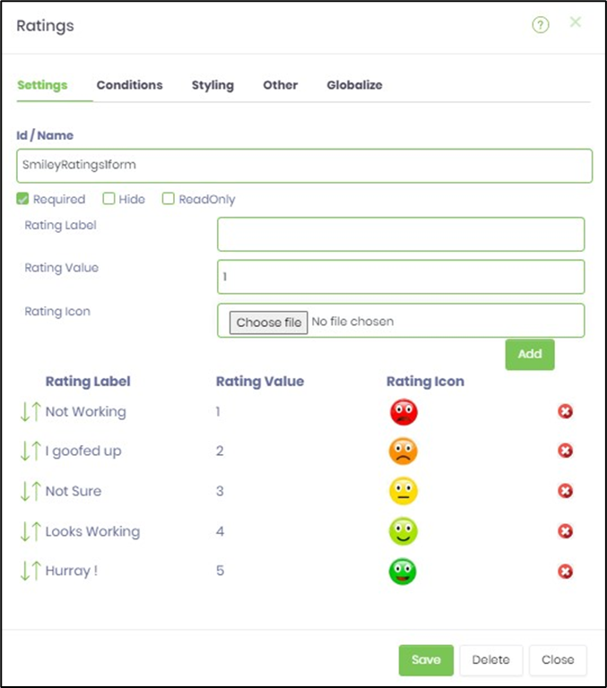
- Select "Settings" tab to configure the inputs as shown in the below graphic
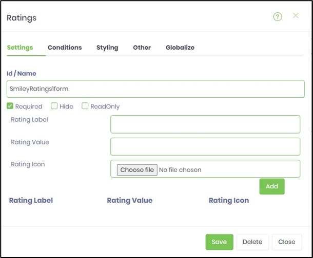
- Choose an image file for the rating icon and provide the label and value. Click on ADD button to build the list.
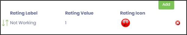
- Repeat the above step for required number of ratings as shown in the image below.
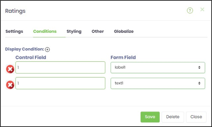
- Click on Save and Navigate to "Conditions" tab. Configure the input as shown below. The label and the text fields are visible when the user selects the rating with value 1, when form is rendered for submission. This tab setup is optional.
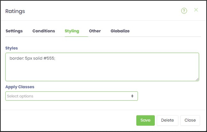
- Click on Save and Navigate to "Styling" tab. Configure the input as shown below. The CSS style scripts are used to enhance the UI. This tab setup is optional.
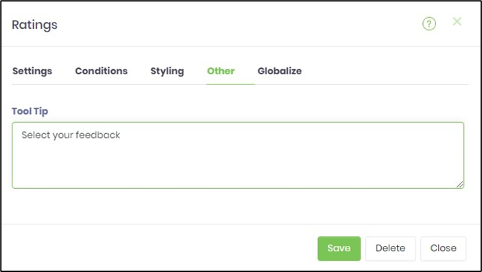
- Click on Save and Navigate to "Other" tab. The tool tip information may be included as shown below. This tab setup is optional.
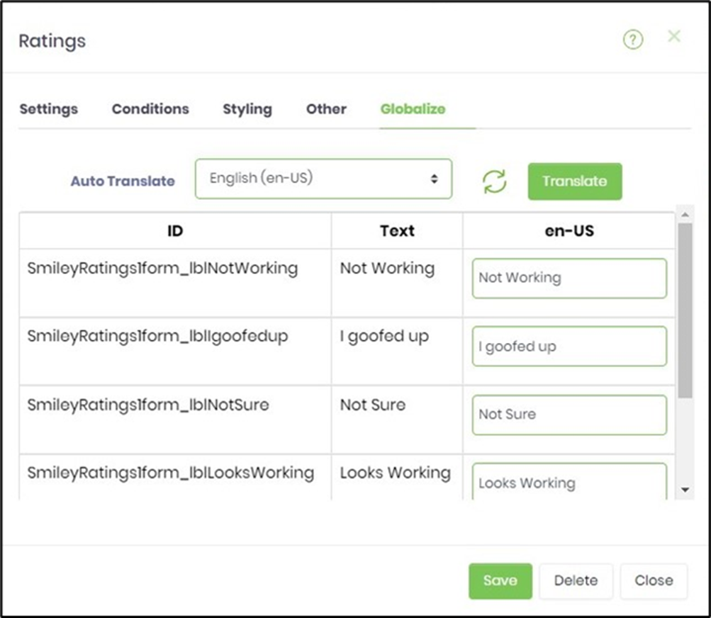
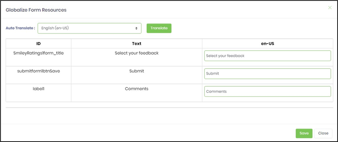
- Click on Save and Navigate to "Globalize" tab. Click on Auto Translate dropdown. Select the language choice. Click on Translate. This tab setup is optional.
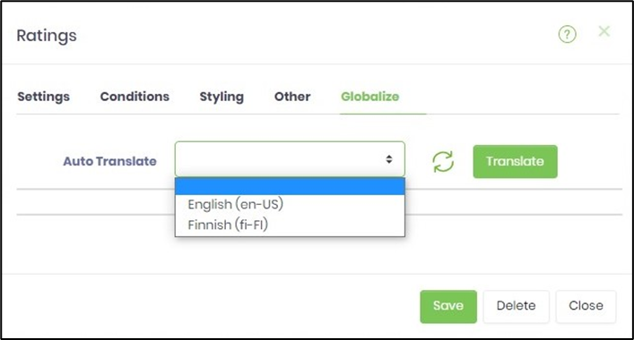
- The translation feature uses Google / Azure ML services (as configured) to render the rating labels. The user may correct the translation (if necessary) before saving the changes.
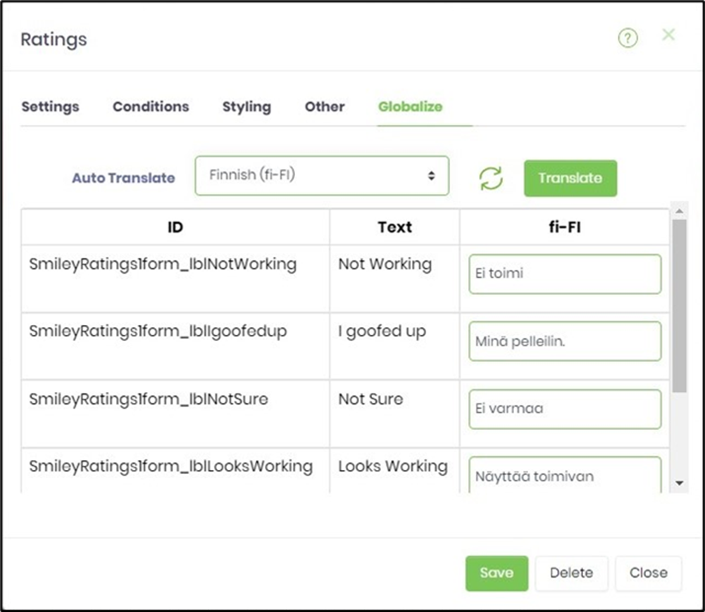
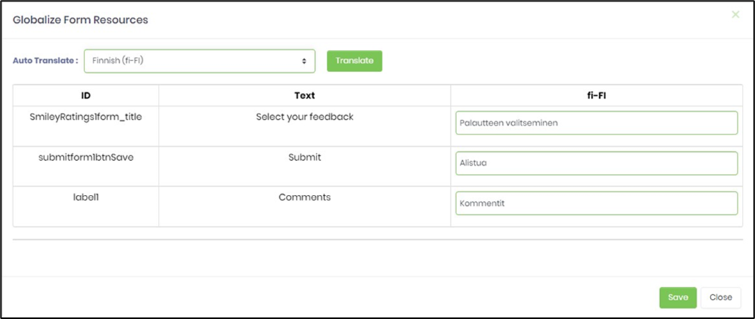
- Here, the translate feature is used to globalise the text in Finnish.
- Save the form definition.
- Navigate to Page - Globalisation to globalize the form resources.
- Navigate to Page - Globalisation to globalize the form resources in Finnish
- Navigate to Form Instance page to create a new instance of this definition. Select the instance and edit.
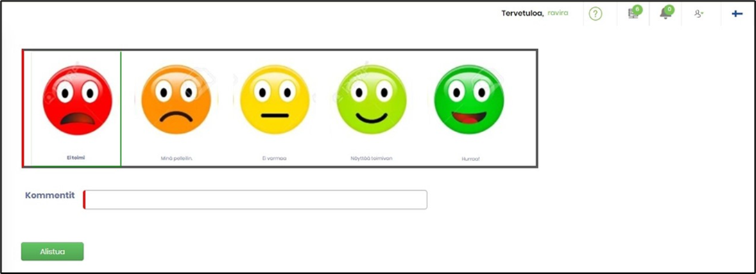
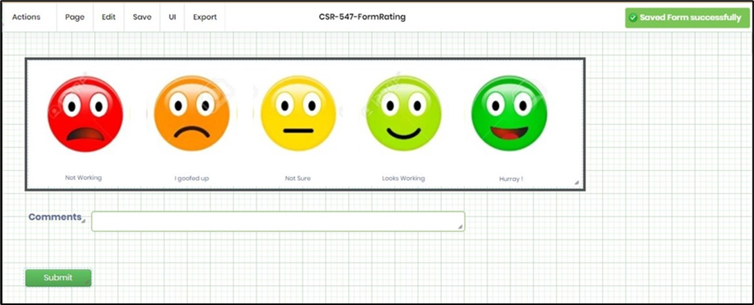
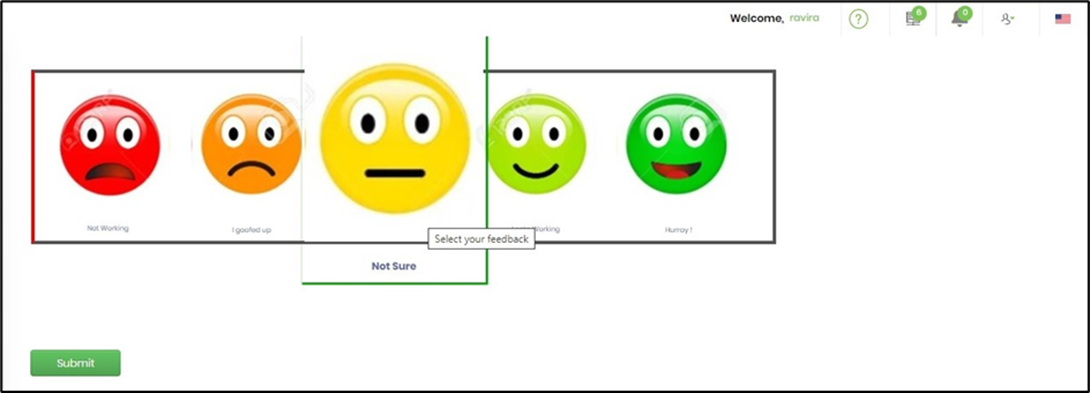
- The rendered widget will appear as shown in the below graphic. Use the language selector to render the form accordingly. Click and mouse over to select the star rating and submit.
- Select the culture flag in top right corner and choose Finnish. The form is rendered accordingly.