Description:
This widget control allows you to define a list of checkboxes for selection. The user can select one or more checkboxes and specify display conditions for other widgets on the form.
Inputs
- ID/Name - Name of widget generated by FlowWright
- Checkboxes - Define the list of items required as checkboxes (comma suffix and unique value for reference)
- Display type - Select between Horizontal / Vertical
- Required - Select the checkbox for mandatory (tick mark)
- Hide - Select the checkbox to Hide (tick mark)
- Read Only - Select the checkbox to Read-Only (tick mark)
- Allow Select All - Select the checkbox to select/unselect all items.
- Display Condition - Define a display condition for other widgets based on the checkbox value
- Styles - Select Label Styles (Bold, Italic, Underline). Select ForeColor and BackColor. Select Font Size. Enter the CSS scripts for widget styles
- Apply Classes - Select between custom classes defined
- Tool Tip - Enter information to display on mouse hover on form render
- Globalize - When applicable
- Translate - Click to translate the text
- Save Translation - Click to save the translated text
- Save - Save the input values
- Delete - Remove this form widget from the designer page
- Close - Close the input popup window
Design:
Example:
Let’s build and execute the “CheckboxDef” example.
- Create a Form Definition called “CheckboxDef.” Navigate to Forms > Definitions on the left pane to create it. On the Form Definitions page, select Actions > Create. Check with your FlowWright administrator if you do not have access to generate form definitions.

- Drag a “BootstrapGrid, Label, Text, Checkbox, and Submit” control onto the canvas and arrange them as shown below.

- Double-click the “Checkbox” widget to configure its “Settings” properties. Provide a name for the widget. Enter static values in the “value, key” format. The “key” is required to control the conditional display (show or hide) of other form fields. Set the default “key” value to pre-select the checkbox. Choose the display layout as “horizontal” or “vertical.” Check the “Required” box for mandatory input. Check the “Multiple items” box to allow multiple options to be selected from the drop-down list. Check the “Hide” box to hide this widget at runtime. Check the “Read-Only” box to view the list without making selections. Check the “Allow” box to enable selecting or unselecting all options with a single checkbox. Click the “Save” button.

- Double-click the “Checkbox” widget to configure the “Conditions” properties. Click the plus sign (+) to add an empty row. Set up the display conditions here. Enter the control key value and link it to the necessary Form field to display it under this condition. Otherwise, the selected Form field remains hidden at runtime. The example below illustrates the label and text Form fields at runtime when the user selects the appropriate “Show” checkbox. Click the plus sign (+) to add more display conditions. The Form controls appear when the correct checkbox values are selected at runtime. Click the “Save” button.

- Double-click the “Checkbox” widget to configure the “Styling” properties. Select the checkbox to add bold, italic, and underline styles to the label. Choose the Fore and Back colors from the drop-down list. Pick the font size from the drop-down list. Provide the CSS syntax. Select the classes to apply from the global drop-down list. Click the “Save” button.

- Double-click the “Checkbox” widget to configure the “Other” properties. Enter the tooltip text and then click the “Save” button.

- Double-click the “Checkbox” widget to configure the “Globalize” properties. The application will alert you if there is nothing to globalize, as shown below. Otherwise, select a language from the drop-down list and then click the “Translate” button. You can overwrite the translated text with something more suitable for your style. Click the “Save Translation” button.

- Navigate to Page > Globalization menu. Select a language from the drop-down list and then click the “Translate” button. Click the “Save” button.

- Save the Form Definition. Choose Actions > Create Form Instance from the menu. Generate a new form instance and select the box to edit it. Contact your FlowWright administrator if you are unable to create Form Instances.

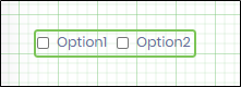
- The Form is rendered for the user as shown below.

- Select the check box to render the label and text (based on the display condition)

- Select the culture flag to view the control in a globalized format.

Definition Sample:
You may download the sample definition(s) from the link provided and later import them (drag-and-drop) into your FlowWright Process Definition (XML file) or Form Definition (HTML file) page.
Note: Please verify and complete the process steps for any missing configurations, such as file path references and database connections, after the import. Then, save the definition to confirm the changes.