Description:
The button widget is a standard HTML button control.
Inputs
- Button Type - Select between Default and other types
- ID/Name - Name of widget generated by FlowWright (read-only field)
- Button Label - Change the button label
- Hide - Select checkbox to Hide (tick mark)
- Read Only - Select checkbox to Read-Only (tick mark)
- Tool Tip - Enter information to display on mouse hover on form render
- Styles - Enter the CSS scripts for widget styles
- Apply Classes - Select between custom classes defined
- Save - Save the input values
- Delete - Remove this form widget from the designer page
- Close - Close the input popup window
Design:

Example:
Let’s build and execute the “ButtonDef” example.
- Create a new form definition called “ButtonDef”
- Select the Open Designer checkbox and click the “Create” button
- Drag a “Button” widget to the canvas
- Double-click on the widget to configure the “Settings” tab. Select the button type from the drop down list - Default, Primary, Info, Success, Warning, Danger and Inverse. The widget name is auto populated and cannot be changed. Provide the text information as button label. Select the checkbox to hide or mark the button as read-only during run time.

- Double-click on the widget to configure the “Styling” tab. Provide the CSS style syntax to enhance the style - the border is seen emphasized with 10px red color in this reference below. Select the class options from the drop down list to apply for HTML elements.

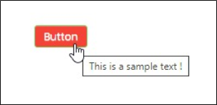
- Double-click on the widget to configure the “Other” tab. Provide the text information to be rendered as tool tip.

- Double-click on the widget to configure the “Globalize” tab. Select the language options from the drop down list and click on Translate button to globalize the button.

- Save the change. Navigate to Run - Form Instances - Create form instance for the above form definition and Edit. The rendered widget will look as shown in the below graphic during run time. Select the language culture on the form to render the button in the globalized format.