Description:
This widget controls let’s you define a list of check boxes for selection. User can select one or many. User can also define a display condition for other widgets on the form.
Inputs
- ID/Name - Name of widget generated by FlowWright
- Checkboxes - Define the list of items required as checkboxes (comma suffix an unique value for reference)
- Display type - Select between Horizontal / Vertical
- Required - Select checkbox for mandatory (tick mark)
- Hide - Select checkbox to Hide (tick mark)
- Read Only - Select checkbox to Read-Only (tick mark)
Allow Select All - Select checkbox to select / unselect all items - Display Condition - Define a display condition for other widgets based on the checkbox value
- Styles - Select Label Styles (Bold, Italics, Underline). Select ForeColor and BackColor. Select Font Size. Enter the CSS scripts for widget styles
- Apply Classes - Select between custom classes defined
- Tool Tip - Enter information to display on mouse hover on form render
- Save - Save the input values
- Delete - Remove this form widget from the designer page
- Close - Close the input popup window
Design:
Example:
Let’s build and execute the “CheckboxDef” example.
- Create a new form definition called “CheckboxDef”
- Select the Open Designer checkbox and click the “Create” button
- Drag a Text box, Label and a Checkbox widget to the canvas

- Double-click on the Label widget to configure the “Settings” tab as shown in the below graphic. Provide a name to the widget. Provide text information for label text. Select check box to enable multiline text information. Select check box to hide or skip globalization when rendered during run time.

- Double-click on the Text box widget to configure the inputs as shown in the below graphic. Provide a name to the widget. Provide text information to the place holder. Select input data type as text from the drop down list. Select check box to hide, render as read-only or input required mandatory during run time. Provide a number value to accept maximum characters as input.

- Double-click on the Checkbox widget to configure the “Settings” tab as shown in the below graphic. Provide a name to the widget. Provide options to render as check box as value,key pair. Select the display type as horizontal or vertical. Select check box to accept input as mandatory, hide, render as read-only or select-all options in one go during run time.

- Double-click on the Checkbox widget to configure the “Conditions” tab. Provide the control field value and map with required form field by name to display the control on a condition. Click on the plus sign (+) to add more display conditions. During run time the form controls are displayed when the appropriate checkbox values are selected. Here, the label and text box controls are displayed on selecting the associated value,key pairs configured above.

- Double-click on the Checkbox widget to configure the “Styling” tab. Select the chec box to enable the label styles - bold, italics and underline. Select the fore color and back color from the drop down color palette list. Select the font size from the drop down list - small, medium, large, x-large, xx-large. Provide the CSS style syntax to enhance the style. Select the class options from the drop down list to apply for HTML elements.

- Double-click on the Checkbox widget to configure the “Other” tab. Provide the text information for the tool tip to render on mouse hover.

- Double-click on the Checkbox widget to configure the “Globalize” tab. Select the language options from the drop down list and click on Translate button to globalize the button.

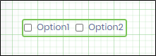
- Click on Save button and Close the popup window. Navigate to UI menu and Preview the form. The form is rendered as shown in the below graphic. Select the language culture on the form to render the check box in the globalized format.

- Select the check box to render the label (as per the display condition)

- Select the check box to render the text box (as per the display condition)
