DigitalSignature Widget

Last published at: May 3rd, 2021

Description:

Displays a digital signature control on the form.

Inputs

  • ID/Name - Name of widget generated by FlowWright (read-only field)
  • Width (px) - Enter the pixel value for width
  • Height (px) - Enter the pixel value for height 
  • Pen Stroke - Enter the value for pen stroke thickness
  • Pen Color -  Select the pen color from the palette
  • Show Underline - Select checkbox to include underline (tick mark) 
  • Hide - Select checkbox to Hide (tick mark)
  • Read Only - Select checkbox to Read-Only (tick mark)
  • Required - Select checkbox for mandatory (tick mark)
  • Tool Tip - Enter information to display on mouse hover on form render
  • Styles - Enter the CSS scripts for widget styles
  • Apply Classes - Select between custom classes defined 
  • Save - Save the input values 
  • Delete - Remove this form widget from the designer page 
  • Close - Close the input popup window

Design:

Example: 

Let’s build and execute the DigitalSignatureDef example.  

  • Create a new form definition called “DigitalSignatureDef
  • Select the Open Designer checkbox and click the “Create” button
  • Drag a Digital Signature widget to the canvas
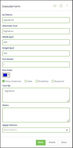
  • Double-click on the Digital Signature widget to configure the inputs as shown in the below graphic

  • Click on Save button and Close the popup window
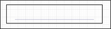
  • Navigate to UI menu and Preview the form. The rendered widget will appear as shown in the below graphic

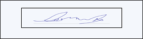
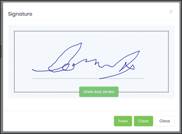
  • Click on the widget control to digital sign. The rendered widget will appear as shown in the below graphic

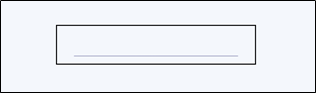
  • Once signed and the “Save” button is clicked, the rendered widget will appear as shown in the below graphic