TextArea Widget

Last published at: August 8th, 2022

Description:

Renders a text area control on the form.

Inputs

  • ID/Name - Name of widget generated by FlowWright (read-only field)
  • Placeholder - Enter text to display on render
  • Required - Select checkbox for mandatory (tick mark)
  • Hide - Select checkbox to Hide (tick mark)
  • Read Only - Select checkbox to Read-Only (tick mark)
  • Tool Tip - Enter information to display on mouse hover on form render
  • Styles - Enter the CSS scripts for widget styles
  • Apply Classes - Select between custom classes defined
  • Maximum Allowed Characters - Enter value to accept maximum allowed chars (in v9.12)
  • Maximum Allowed Words - Enter value to accept maximum allowed words (in v9.12)
  • Save - Save the input values 
  • Delete - Remove this form widget from the designer page 
  • Close - Close the input popup window
Delete

Note

The Text Area widget shall accept line breaks and manual space as indentations. Using tabs, soft line breaks and other text styles are not suggested due to 3rd party component constraints.  

Design:

Example: 

Let’s build and execute the TabWidgetDef example.  

  • Create a new form definition called “TabWidgetDef
  • Select the Open Designer checkbox and click the “Create” button
  • Drag a Text Area widget to the canvas
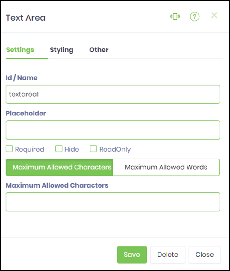
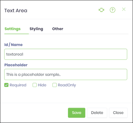
  • Double-click on the Text Area widget to configure the inputs as shown in the below graphic

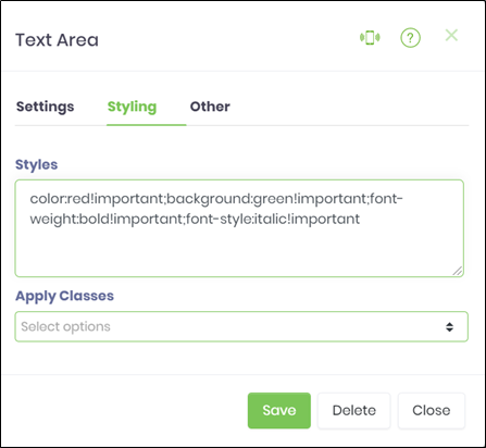
  • Click on Styling Tab to configure the inputs as shown in the below graphic

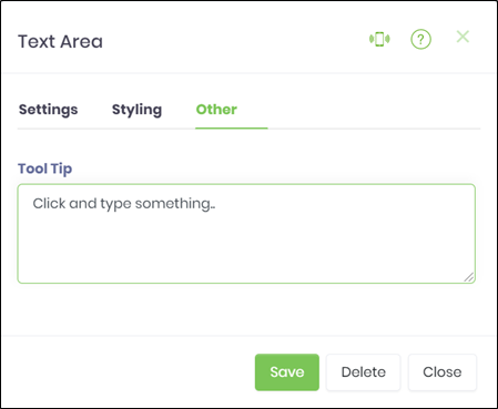
  • Click on Others Tab to configure the inputs as shown in the below graphic

  • Click on Save button and Close the popup window
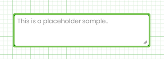
  • Navigate to UI menu and Preview the form. The rendered widget will appear as shown in the below graphic.
  • NOTE
    • The Text Area widget shall accept line breaks will appear as shown in the below graphic.
    • In v9.12 the text area control content can be limited by # of characters or words