Description:
This widget renders a text input control.
Inputs
- Input Size - Select between any of the display sizes
- ID/Name - Name of widget generated by FlowWright (read-only field)
- Placeholder - Enter text to display on the render
- Data Type - Choose between any of the data types (Numeric,
- Currency, Phone, Email, SSN, Text, Password, Regular Expression, Custom Format)
- Required - Select the checkbox for mandatory (tick mark)
- Hide - Select the checkbox to Hide (tick mark)
- Read Only - Select the checkbox to Read-Only (tick mark)
- Maximum Allowed Chars - Enter value for maximum text chars to be input
- Tool Tip - Enter information to display on mouse hover on form render
- Styles - Enter the CSS scripts for widget styles
- Apply Classes - Select between custom classes defined
- Save - Save the input values
- Delete - Remove this form widget from the designer page
- Close - Close the input popup window
Design:
Example:
Let’s build and execute the “TextWidgetDef” example.
- Create a Form Definition called “TextWidgetDef.”
- Drag a “BootstrapGrid, Label, Text, and Submit” control to the canvas and arrange them as shown below.

- Double-click the “Text” widget to configure the “Settings” properties. Provide a name for the control and overlay text for the placeholder. Select the data type from the drop-down list. Provide the default text value. Select the checkbox “Required” for mandatory input. Please select the checkbox to hide the control and make it read-only during runtime. Provide the value to accept the maximum characters. Click the Save button.

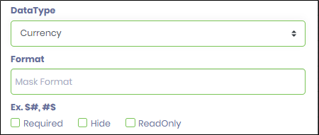
- The Currency data type will render a format input control as shown below. Provide the mask format to regulate the input value (for example: ###,###.##)
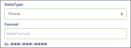
- The Phone data type will render a format input control, as shown below. Provide the mask format to regulate the input value.
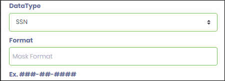
- The SNN data type will render a format input control, as shown below. Provide the mask format to regulate the input value (for example: ###-##-####)
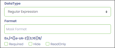
- The Regular Expression data type shall render a format input control as shown below. Provide the mask format to regulate the input value (for example: /^([a-zA-Z]{3,10})$/)
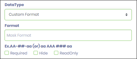
- The Custom Format data type shall render the input control as shown below. Provide the mask format to regulate the user input (for example: AA-##-aa (or) aa AAA ### aa). The case represents a single letter (A or a) and a single-digit number (#). A space and non-numeric symbols like (-\/?*&^#@!) can be used as separators. The sample matching input for the above format is AB-12-ab (or) dx ABC 123 aa.
- Double-click the “Text” widget to configure the “Styling” properties. Select the UI width size from the drop-down list (Mini, Small, Medium, Large, X-Large, XX-Large). Provide the syntax for the CSS styles. Select the classes to apply from the global drop-down list.

- Double-click the “Text” widget to configure the “Other” properties. Provide the tool tip text information. Click the Save button.

- Double-click the “Text” widget to configure the “Globalize” properties. The application will alert you if there is nothing to globalize, as shown below. Otherwise, select the language from the drop-down list and click the Translate button. Click the Save button.

- Save the Form definition. Select Actions - Create Form Instance menu option. Generate a new Form Instance and select the check box to edit this Form Instance.

- The Form is rendered to the user with the default value. Provide the user input. The text value exceeding 10 characters is not accepted as per the configuration. Click the Submit button to complete.

Definition Sample:
You may download the sample definition(s) from the link here and later import them (drag-and-drop) to your FlowWright Process Definition (XML file) or Form Definition (HTML file) page.
Note: Please verify and complete the process steps for any missing configurations, such as file path references and database connections, after import. Then, save the definition to confirm the changes.
Click here to download the sample file.