Description:
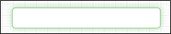
Renders a text input control.
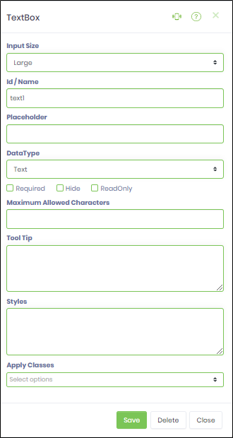
Inputs
- Input Size - Select between any of the display size
- ID/Name - Name of widget generated by FlowWright (read-only field)
- Placeholder - Enter text to display on render
- Data Type - Choose between any of the data types (Numeric,
- Currency, Phone, Email, SSN, Text, Password, Regular Expression, Custom Format)
- Required - Select checkbox for mandatory (tick mark)
- Hide - Select checkbox to Hide (tick mark)
- Read Only - Select checkbox to Read-Only (tick mark)
- Maximum Allowed Chars - Enter value for maximum text chars to be input
- Tool Tip - Enter information to display on mouse hover on form render
- Styles - Enter the CSS scripts for widget styles
- Apply Classes - Select between custom classes defined
- Save - Save the input values
- Delete - Remove this form widget from the designer page
- Close - Close the input popup window
Design:
Example:
Let’s build and execute the “TextWidgetDef” example.
- Create a new form definition called “TextWidgetDef”
- Select the Open Designer checkbox and click the “Create” button
- Drag a Text widget to the canvas
- Double-click on the Text widget to configure the inputs as shown in the below graphic
- Click on the Placeholder field. Enter text to be displayed on render.
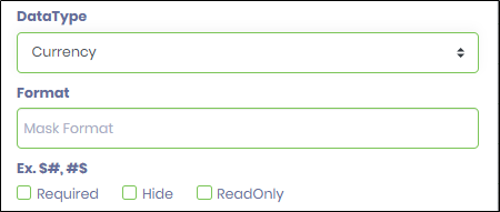
- Click on the Data Type field. Select Currency data type will render a format input control as show in the below graphic. Type the mask format to accept input (eg: ###,###.##)
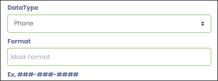
- Select Phone data type will render a format input control as shown in the below graphic. Type the mask format to accept input.
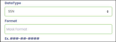
- Select SNN data type will render a format input control as show in the below graphic. Type the mask format to accept input (eg: ###-##-####)
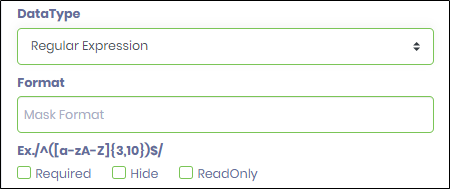
- Select Regular Expression data type will render a format input control as show in the below graphic. Type the mask format to accept input (eg: /^([a-zA-Z]{3,10})$/)
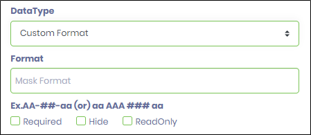
- Select Custom Format data type will render a format input control as show in the below graphic. Type the mask format to accept input (eg: AA-##-aa (or) aa AAA ### aa). Here a single letter is represented by the case as (A or a) and a single digit number is represented as (#). A space and non-numeric symbols like (-\/?*&^#@!) can be used as separators. The sample matching input for the above format is AB-12-ab (or) dx ABC 123 aa.
- Click on Save button and Close the popup window
- Navigate to UI menu and Preview the form. The widget will render a text input control.